This was roughly my plenary talk at Herenga Delta, the 13th Southern Hemisphere Conference on the Teaching and Learning of Undergraduate Mathematics and Statistics. I was invited to give a talk around StatsChat. It’s only approximately my talk because it’s based on working notes rather than a transcript. I also gave a shorter talk with some of this material at Skepticon, the joint NZ and Australian Skeptics conference
Kia ora koutou and thanks for inviting me
I’ve been living in NZ for 11 years, and about 10 years ago my department started a blog on statistics in the media. Mostly to raise public awareness that we even exist, and partly as a resource for teachers. Over time, journalists have also become interested in it. Doing Statschat has raised my opinion of journalists – the problem is more about their incentives and resources, and as I’ll talk about later, the loss of context from physical newspapers
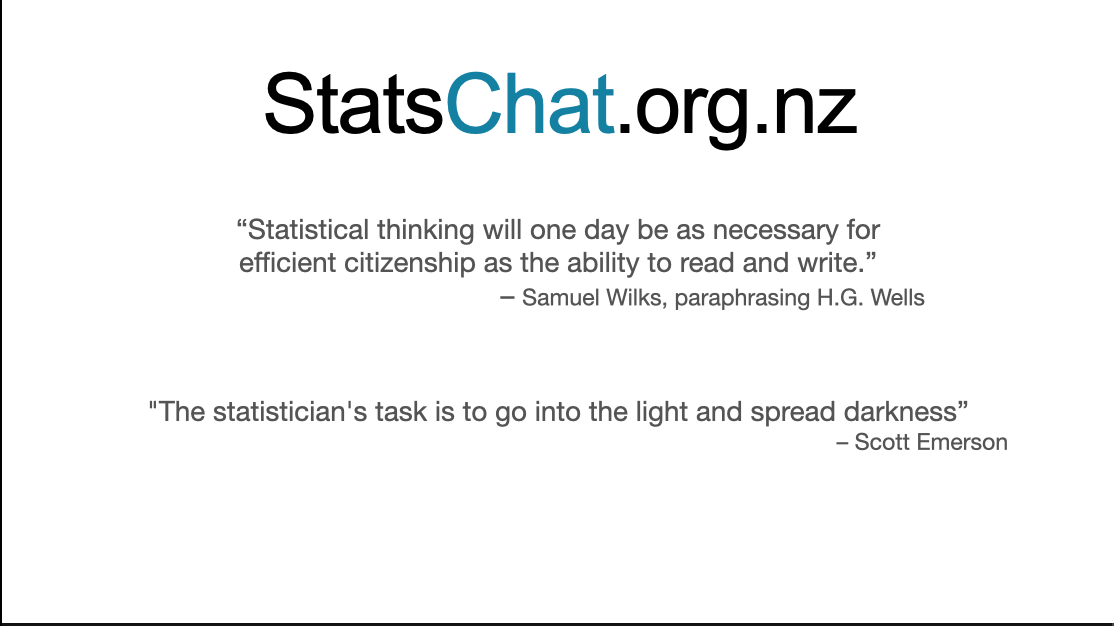
The masthead quotation is a paraphrase of H G Wells by the then president of the American Statistical Association, Samuel Wilks
The other quote is more recent; Scott was one of my mentors at the University of Washington. The claim is obviously exaggerated, but the basic message is true: statistics is a filter for helping you not believe things.
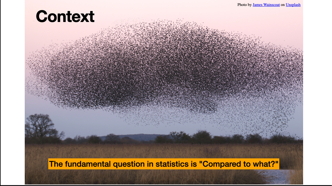
One of the key aspects of statistical reasoning is context for numbers. They aren’t just an undifferentiated mass, they have relationships. The fundamental statistical question is “compared with what?”
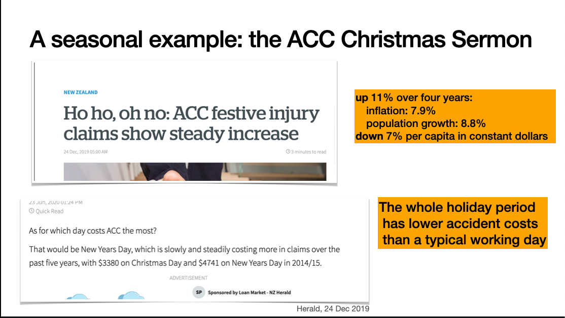
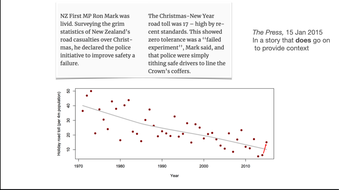
A seasonal example is the Accident Compensation Commission ‘Christmas Sermon’. The ACC provide no-fault treatment and compensation for injuries in New Zealand. As part of that mission, they try to reduce injuries, including with annual press releases about the dangers of Christmas. These are usually picked up by the media, often without much critical thinking.
This example from 2019 shows two issues: the dollar value of claims is up over four years, and numbers are given for Christmas Day and New Year’s Day. However, the increase is smaller than you’d expect given population increase and inflation: the real per capita cost is down. And the figures for the two holiday days aren’t shown in the context of the higher accident costs for a normal working day.
Christmas season injuries are real, but they aren’t increasing and they’re lower than non-holiday days.
Journalists are perfectly able to do numbers or ask for help if they need to – but the message from employers and readers is that they don’t need to.
Looking at statistics in the media is useful for teaching examples, but also because it gives a good window on what the general reading public don’t notice as obviously wrong.

I had expected StatsChat would mostly be about “correlation is not causation” but it’s mostly been about context at more basic levels than that.
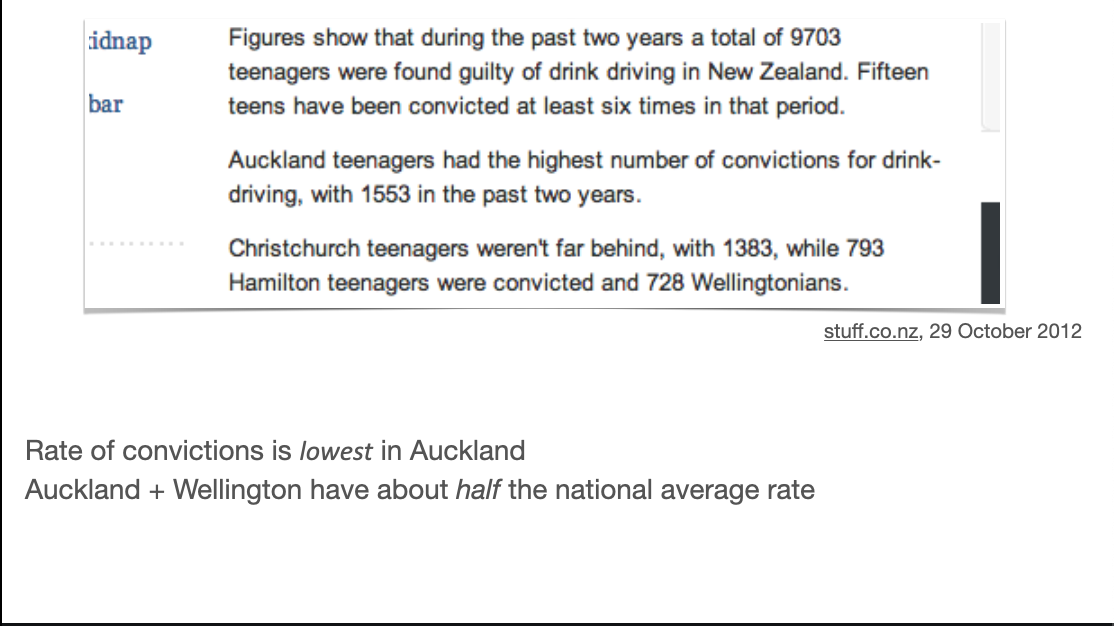
We usually care more about rates or risks than counts. Sometimes going for counts actually obscures the story.
As in this case, Auckland usually has the highest count over the NZ regions, because it has the highest population. In this example, of teenage drink driving convictions, Auckland has a lower rate than any other region, whether you use total population, drivers licences, or teen population
There’s a story here, but it’s the opposite of the one given
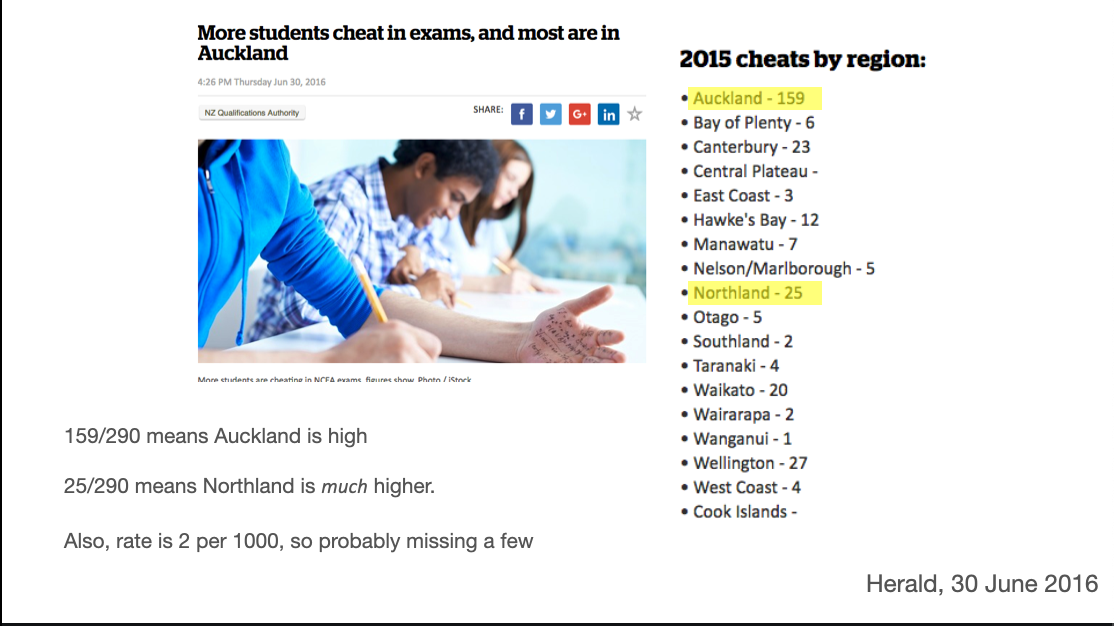
In this 2016 comparison of students caught cheating, Auckland (with about a third of the national population) does have an anomalously high rate. But Northland, with a much smaller population, stands out a lot more and is missed in the story.
Also, the number caught cheating nationally is about 0.2% of the number taking the exams, which suggests to me that a reasonable number of cheats got away with it.
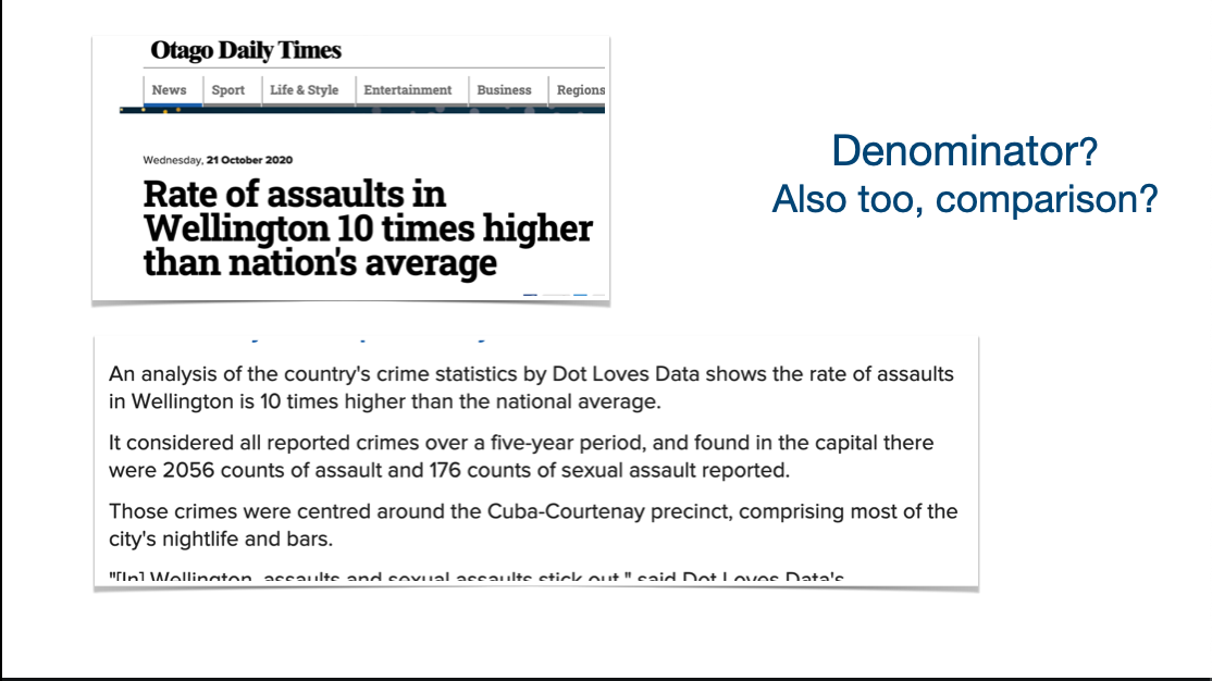
There isn’t always a good denominator, and dividing by the convenient one can make things worse. There’s an overgeneralisation in the headline going from the central Wellington Cuba/Courtenay precinct to the whole city: as given, it’s simply wrong. There’s a more important problem in the analysis using local residents as the denominator.
People come to central Wellington bars and nightclubs from all over the area, and neither the victims nor the perpetrators of assaults in the Cuba/Courtenay precinct necessarily live there – especially as the numbers are only for assaults in public places.
There’s also a more subtle statistical question: what comparison is actually interesting here? Are we interested in whether this part of Wellington is more dangerous for an individual looking for a night out? Are we interested in whether reducing alcohol consumption or generally getting rid of people in this part of Wellington would reduce crime (rather than relocate it)? These are quite different questions, but neither one is answered by crude rates per head of local population. For the first, you’d want a denominator of local partying population – maybe from cellphone location data. For the second, you’d need a causal model and much more data, or an experiment.
News is fundamentally about how today is different from yesterday (or, more precisely, how yesterday was different from the previous day), so change is important, but interpreting random variation is a problem
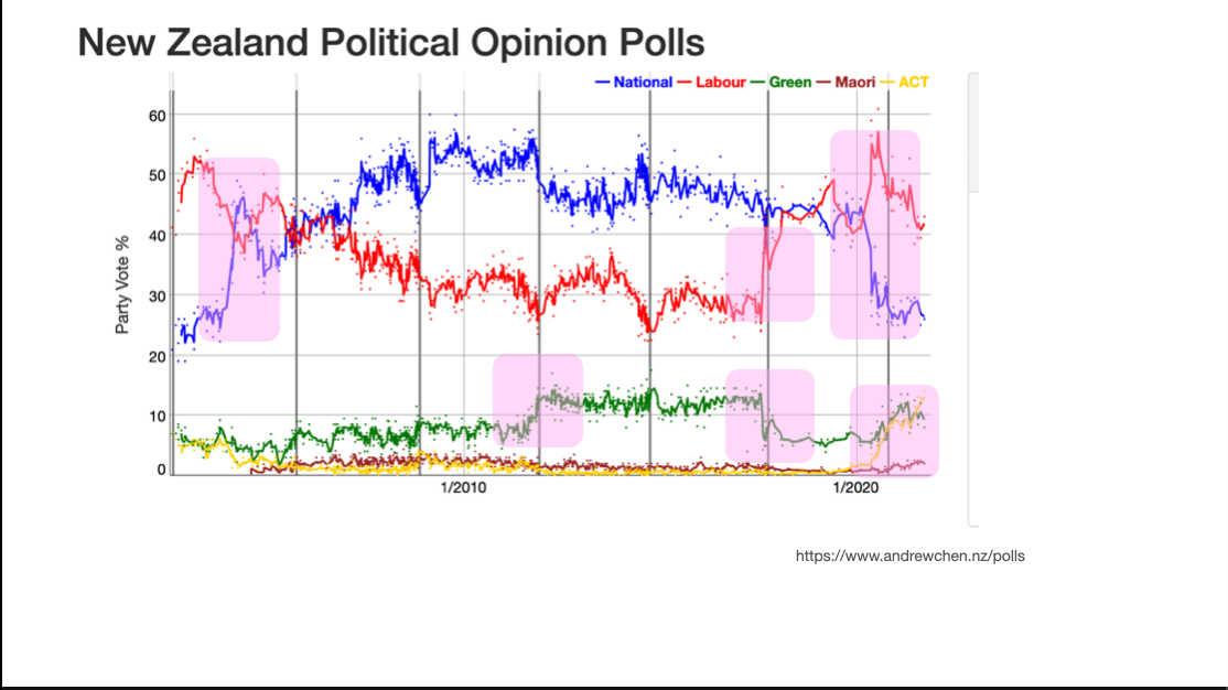
Political opinion polls are a popular example of reporting change in the media. Here’s a picture from Andrew Chen’s visualisation of NZ opinion polls. It’s showing the variation over time as a mixture of a real trend and noise around the trend. The highlights indicate some places where (at least with hindsight) we can be sure there were changes in attitude: the recent rise of ACT (lower right), the arrival of Jacinda Ardern in Labour, the departure of Metiria Turei from the Greens, and so on.
On top of that we have random sampling variation, haphazard variation in poll quality, trends in participation, and everything else that comes into total survey error
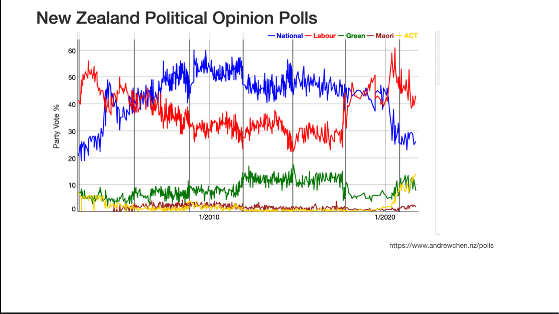
This is how polls are reported: everything is trend
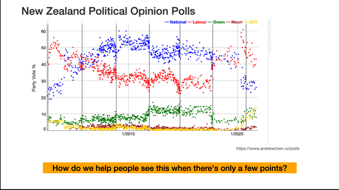
This is the default in Andrew’s app. There are enough polls for us to just see the trend and the variation around it.
A big question for statistics education and for statistics in the media is how to let people see that the data are like this when there aren’t so many points
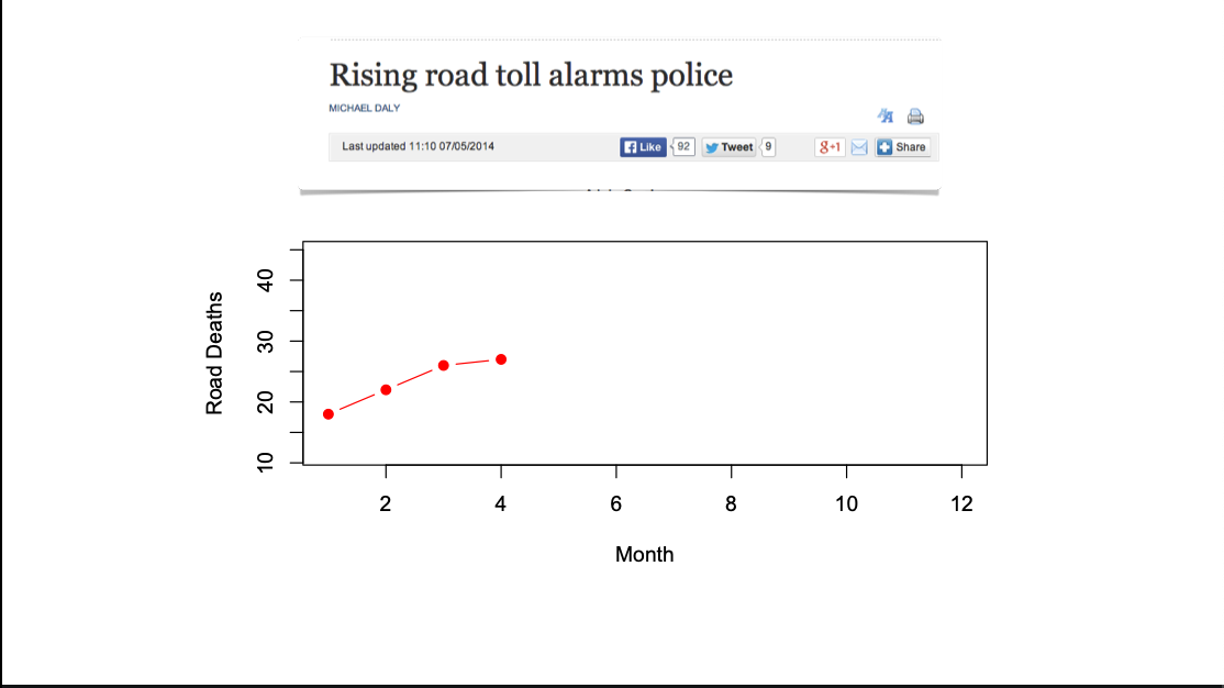
One repeated topic early on in StatsChat was stories about month-to-month variation in road deaths, where the signal to noise ratio is pretty useless. We don’t get these stories so much now, and it’s possible StatsChat is one of the reasons.
If you’re a mathematician, your instinct would be to fit a model for random variation, such as a Poisson model. That works reasonably well – longer term analyses show the data are overdispersed relative to Poisson, but if even Poisson noise would make the trend uninterpretable, it’s uninterpretable. The problem is explaining both the idea of random variation when the data are complete, and the motivation for a Poisson model when it’s not a great fit. The Poisson analysis is a sensible one, but relatively hard to communicate effectively
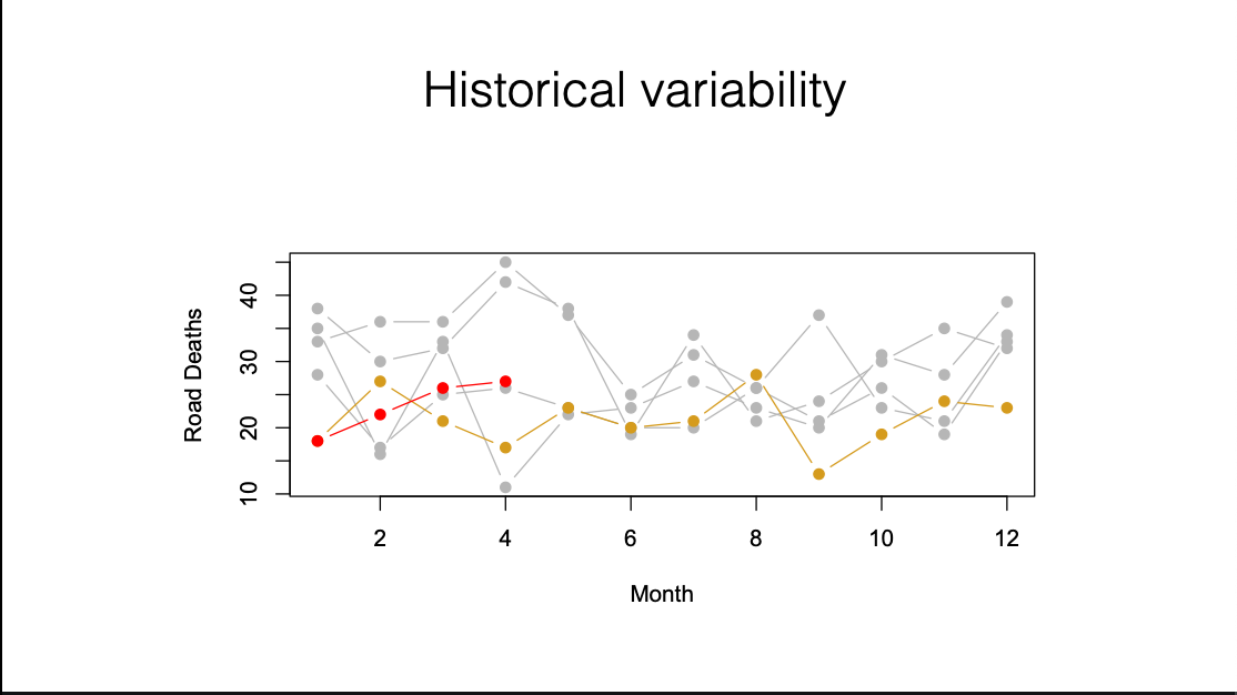
Another option is historical variability. We’ve got the current ‘worrying trend’ in red, the previous year in yellow, and the four years before that in grey. It’s clear the year-to-year variation swamps the apparent trend, without getting into the metaphysics of randomness
This one doesn’t really need much comment
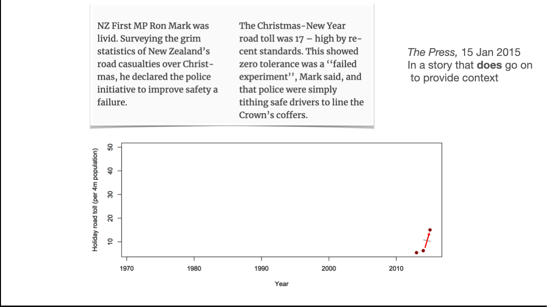
Numbers in political advertising tend to be (a) precisely correct, in some interpretation that (b) is not the most useful interpretation. Adding more temporal context to a two-point trend is almost always helpful.
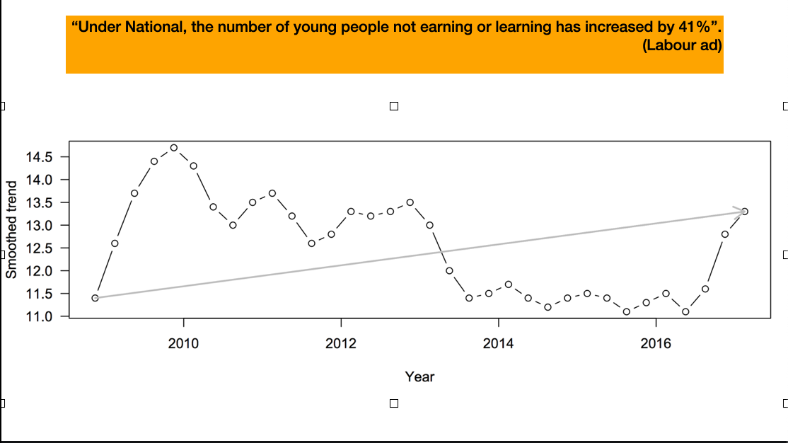
It’s not exclusively one side of politics. Here, Labour seems to miss a trick – the high number of young people Not in Employment, Education, or Training (NEETs) early in the period is probably the Great Recession, which is the fault of no-one in New Zealand, but the increase late in the period is interesting
It used to be clearer from physical context which bits of the newspaper we were were supposed to believe, like investigative journalism and sports and recipes, and which bits were just filler or entertainment.
In particular, bogus online self-selected polls with no demographic data are useless. No matter how useless you think they are, they’re more useless than that
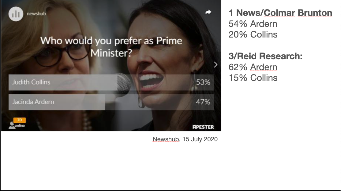
This one shows Judith Collins and Jacinda Ardern, the two major party leaders, as very close in popularity; the two contemporaneous real polls agree this wasn’t remotely true
Bogus opinion polling matters in a democracy because polls are one of the ways we can find out that our friends are not typical of the voting population. It seems to me that polling has to be helpful in getting people to accept election results they would otherwise be shocked by
Bogus polls look misleading similar to real polls but they’re actually more like the ‘area man’ street polling
One problem is loss of context from physical newspapers: is this the part of the paper you’re supposed to believe or the filler?
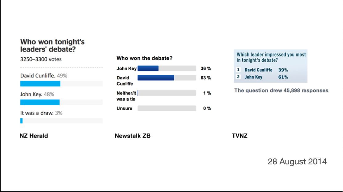
Sometimes we get simultaneous bogus polls from different outlets and can see how bad they are. These polls were on the same night about the same question
There’s more variation between these proportions than there would be for random samples of ten people, and that’s before worrying about bias
Bogus polls aren’t even (in any useful sense) a summary of the attitudes of readers of one media outlet.
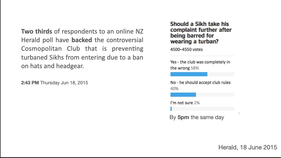
In 2015, a Sikh man went to a club that prohibits wearing headgear, and was not allowed in because of his turban. The NZ Herald had a bogus poll on whether this was ok. The initial voting was supportive of the club; by evening it had turned around.
One of the other problems with bogus polls is anchoring bias: given a starting number, we tend to work by adjusting that number up or down, even when it’s obviously not a good estimate.
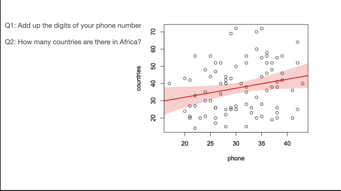
A classic example of this, which I tried at a school talk, is to get people to write down an obviously irrelevant number and then an estimate of some quantity. In this case I used the sum of digits in their phone numbers and the number of countries in Africa. The correlation isn’t all that strong, but it’s a prespecified hypothesis in front of a live audience, and it looks to be real.
To the extent that anchoring bias is important, bogus polls make you less well informed – they suck information out of your brain
The other important statistical theme that shows up a lot in StatsChat is the importance of measuring the thing you care about, rather than just analyzing some convenient related number
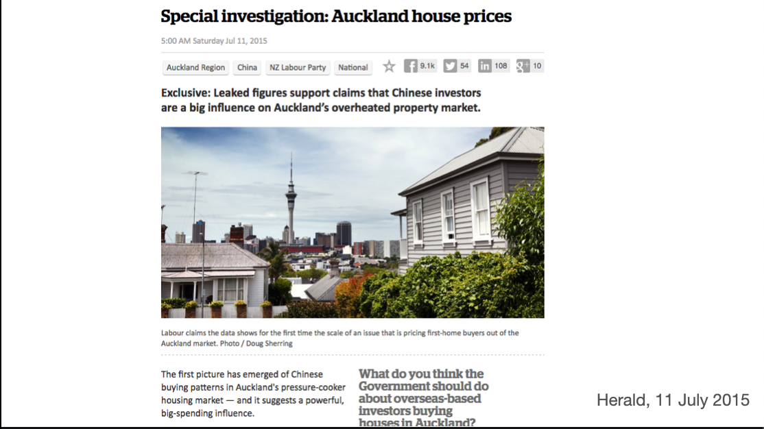
The “Chinese-sounding names” controversy came up in 2015. Someone gave the Herald data on real-estate buyers, together with estimates that a lot of them were of Chinese ethnicity. At the time, there was controversy about the role of overseas investors in NZ’s rising housing prices
The mathematical part of this is fine: people called Cui or Xu are mostly of Chinese ethnicity, people called Harawira or Borich or Lumley are mostly not. People called Law or Lee split in some relatively consistent way. You won’t get individuals right, but you should be able to get proportions right.
The problem is that Chinese ethnicity is not the question. The question was about overseas investors. Peter Thiel is an overseas investor but not of Chinese ethnicity; my neighbours are of Chinese ethnicity but not overseas investors.
To be fair, the Herald did put the caveats in the story (further down)
Because I work in medical statistics, where the ‘surrogate outcome’ issue is especially salient, there’s a lot of StatsChat coverage of overinterpreted medical science. These stories are usually not written in New Zealand; they are usually imported from the UK.
One interesting question with these stories is the extent to which different parties are culpable: the researchers, the university or journal public relations people, the journalists. It varies a lot.
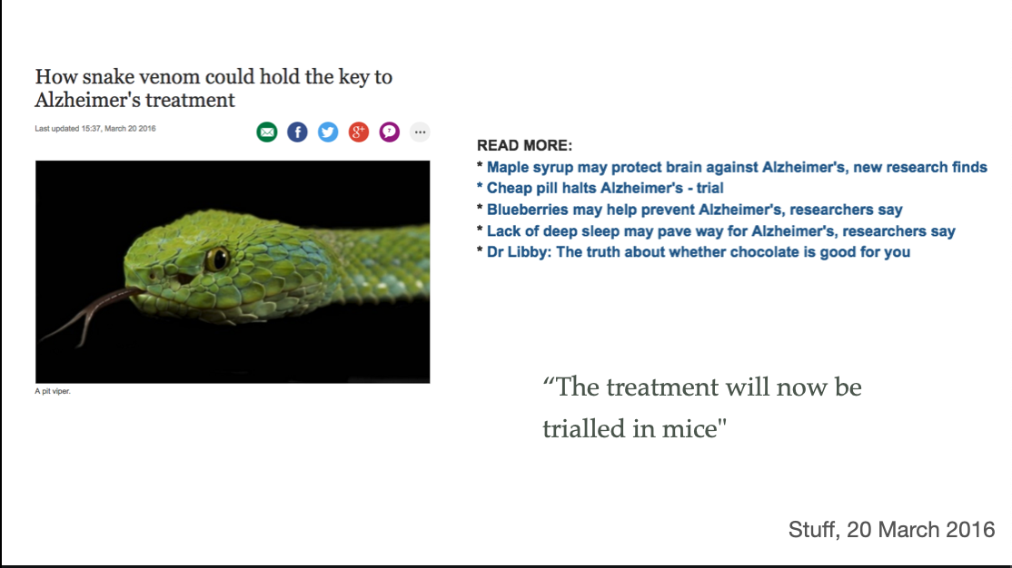
This research was on using a protein from snake venom to break down the protein amyloid beta. It was only a lab bench study – not even mice yet. And it’s increasingly unclear that breaking down amyloid will help. And that’s the wrong snake (it’s prettier than the right snake)
The ‘Read more’ stories are just as exaggerated
Alzheimers is particularly bad because nothing actually works. It’s like aliens: there are genuine efforts in SETI and exobiology, but it’s hard, so anything dramatic will be crop circles and UFOs and the serious stuff is “we’ve found this planet that’s a bit less uninhabitable than the previous ones”
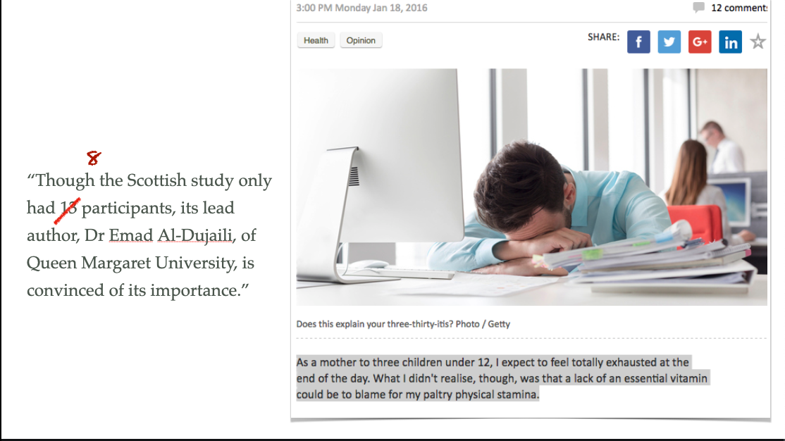
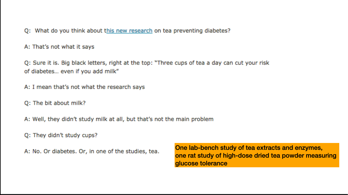
This story was about someone who’d started taking vitamin D and felt better afterwards. The science hook was a tiny study that wasn’t published, only presented at a conference: there were 13 people recruited but the comparison was before/after treatment, so only the 8 people who got vitamin D contributed. The effects of vitamin D supplementation have been studied in much, much bigger trials, though not with the same positive results. Context matters
The result could conceivably be true, but the story isn’t aimed at people who care whether it’s true
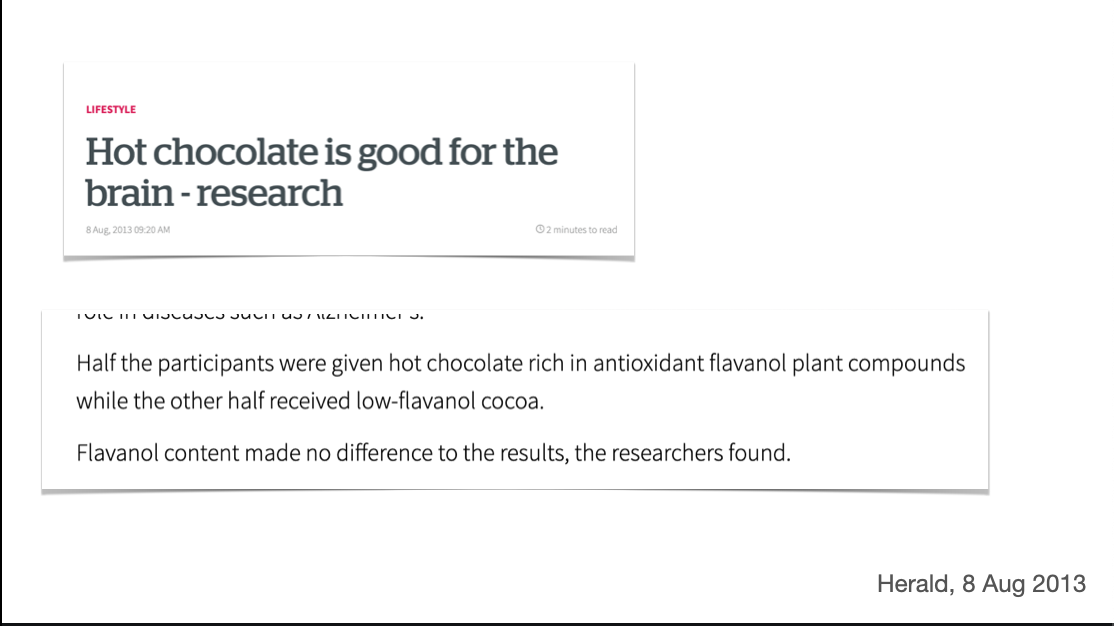
And as a final example, the chocolate/beer/red wine/coffee story. Lots of us like chocolate or beer or red wine or coffee, so there’s always a market for stories saying they’re good for you. You need some science background for the story, but you can stretch it a lot
Here: randomisation to low-flavanol vs high-flavanol cocoa, with the aim of showing the flavanols were beneficial. Sadly, there was no evidence of difference between the two groups. There was improvement, with both drinks, in a subset of the participants, though. This is definitely a negative result for the hypothesis being studied, but one you can spin as ‘yay chocolate’.
It doesn’t really matter when people do this with chocolate, in some world historical sense. But it amounts to pissing in the swimming pool of public discourse. It makes it easier for unconvincing differences in a subset of a study to be taken as evidence when it does matters.
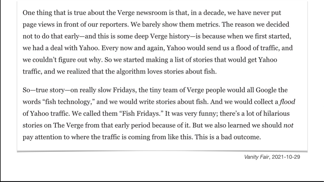
So, whose fault is all of this? Primarily, yours.
That is, ours: the readers. The media are under more financial pressure now than ever before, and this combines with more detailed measurements of who reads each story.
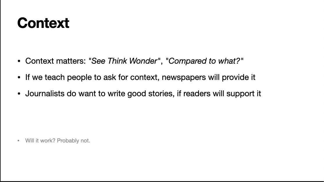
In teaching statistics, context matters. We can try to teach people that data isn’t just numbers, data is people (or kākāpō or black holes or whatever) and show them how to connect the numbers to the world. News stories are a good starting place
If we teach people to ask for context, the media might provide it
At a personal level, we need to think more about paying for high-quality journalism – and even paying for moderate-quality journalism as leverage. The news sites know what stories their subscribers read, and they care.
The Prime Directive for statistical reporting is that context matters, but there are some additional rules that have been important in ten years of StatsChat