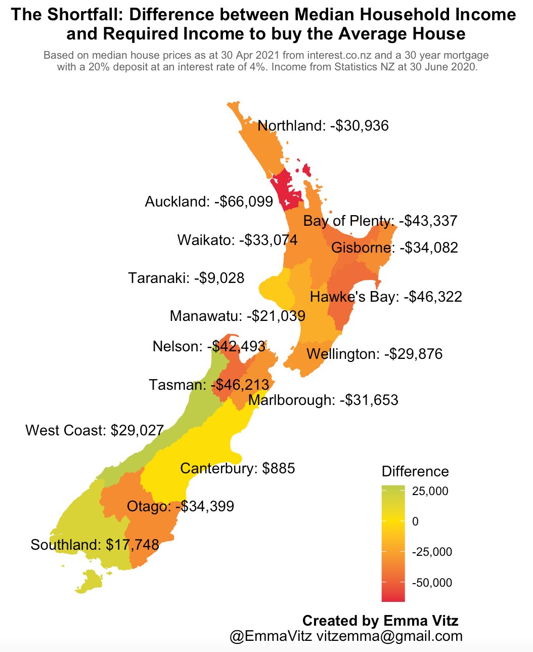
A couple of days ago, Emma Vitz posted some depressing maps of NZ housing affordability on Twitter. Here’s one of them

The map shows, for each NZ region, the difference between the median household income and the income required to buy the average house. ‘Income required’ is based on the recommendation to spend no more than 30% of your income on housing, together with assuming a 20% deposit and 4% mortage interest.
I wanted to compare with hexmap versions. First, the data:
df<-read.table(text="
region  shortfall
Northland -30936
Auckland -66099
'Bay of Plenty' -43337
Waikato -33074
Gisborne -34082
Taranaki -9028
'Hawkes Bay' -46322
Manawatu-Wanganui -21039
Wellington -29876
Nelson -42493
Tasman -46213
Marlborough -31653
'West Coast' 29027
Canterbury 885
Otago -34399
Southland 17748
", header=TRUE)
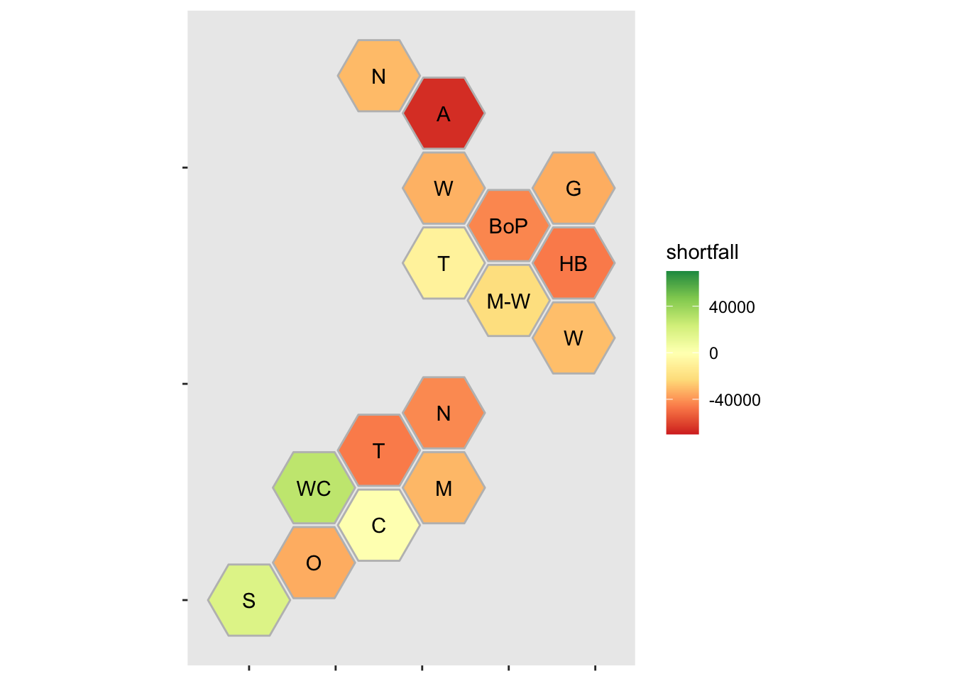
The hexmaps are created with the DHBins package
library(DHBins)## Loading required package: ggplot2ggplot(df)+
geom_region(aes(map_id=region_fixname(region),
fill=shortfall),colour="grey")+
geom_label_region(short=TRUE,colour="black")+
scale_fill_distiller(type="div",palette="RdYlGn",direction=1,limits=c(-70000,70000))
geom_region does the layout of NZ regions and geom_label_region labels them. The explicit limits on the colour scale force zero to be in the middle of the diverging scale
The hexmap is much less pretty than the real map. It’s less readable if you aren’t from New Zealand. The real map also shows more geographical detail, such as exactly where Canterbury splits from Otago or Otago from Southland. From another point of view, that’s the advantage of the hexmap: the data really are just a single average value per region, and don’t have all the geographic detail implied by the real map.
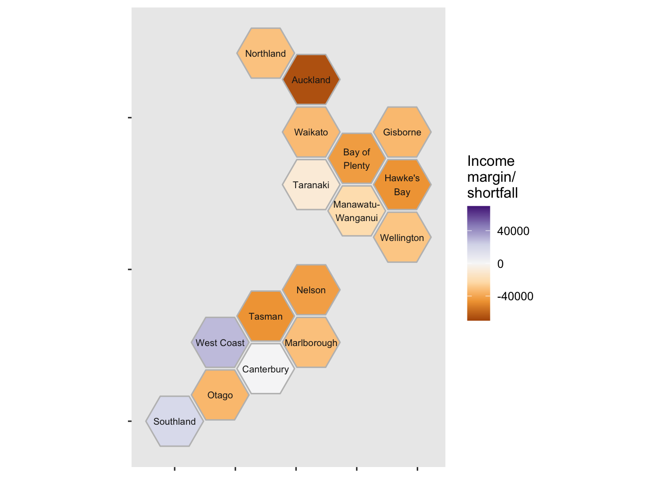
Here’s another variation, avoiding a red:green colour scale and using the full region names, and with light gray outlines around the hexes:
ggplot(df)+
    geom_region(aes(map_id=region_fixname(region),
                    fill=shortfall),colour="grey")+
  geom_label_region(short=FALSE,colour="grey10",size=2.5)+
  scale_fill_distiller(type="div",palette="PuOr",
                       direction=1,limits=c(-70000,70000),
                       name="Income\nmargin/\nshortfall")