The NZ Ministry of Health has been releasing information about COVID-19 cases, and Chris Knox (of the NZ Herald) has been collating it on github
Here, I’m going to map it by District Health Board, using theDHBins package. If you’re following along at home, you need the development version of the package, from github.
library(DHBins)## Loading required package: ggplot2library(readxl)
case_r<-read_xlsx("~/nz-covid19-data/data/dhb-cases.xlsx")
case_r<-subset(case_r, `Case Status`=="Confirmed cases" & DHB!="Total")Next, we need population data. That’s already in the package
data(dhb_cars)

popsize<-data.frame(dhb=dhb_cars$dhb, Total=rowSums(dhb_cars[,-1]))
I’m going to do a split hex map where there’s a hex for each District Health Board, with half of the hex showing the population and the other half showing the number of cases. That means I need to divide each hex into six triangles, and use three for population and the other three for number of cases. Actually, I need two superimposed hexes for each District Health Board, because you can’t vary the radius of a triangulated hex. Half of each hex will be NA.
pop_tri<-popsize[rep(1:nrow(popsize),each=6),]
pop_tri$group<-rep(rep(c("blank","Population"),each=3),nrow(popsize))
pop_tri$order<-rep(c(1,2,6,3,4,5),nrow(popsize))


case_tri<-case_r[rep(1:nrow(case_r),each=6),]
case_tri$group<-rep(rep(c("Cases","empty"),each=3),nrow(case_r))
case_tri$order<-rep(c(1,2,6,3,4,5),nrow(case_r))
Now, assemble the plot. First, an outline for each hex
ggplot(case_tri)+
  geom_dhb(data=popsize, aes(map_id=dhb),fill="grey98")
Now, add the population sizes
ggplot(case_tri)+
  geom_dhb(data=popsize, aes(map_id=dhb),fill="grey98")+
  geom_dhbtri(data=pop_tri,aes(map_id=dhb,fill=group,class_id=order,radius=sqrt(Total)),
              coord=FALSE, show.legend=FALSE)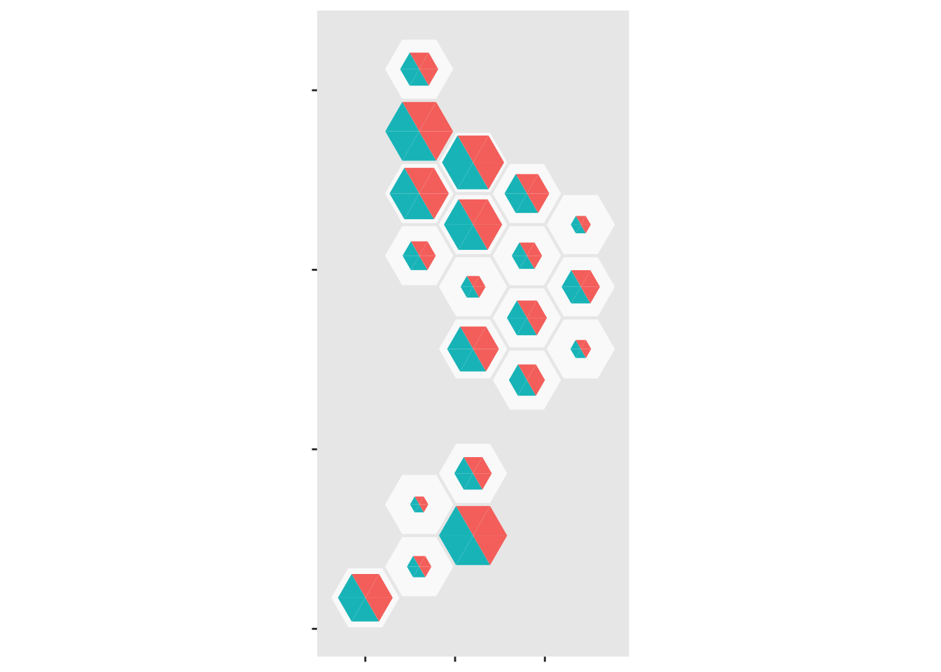
But we need to suppress half of that
ggplot(case_tri)+
  geom_dhb(data=popsize, aes(map_id=dhb),fill="grey98")+
  geom_dhbtri(data=pop_tri,aes(map_id=dhb,fill=group,class_id=order,radius=sqrt(Total)),
              coord=FALSE, show.legend=FALSE)+
  scale_fill_manual(values=c(blank=NA,Population="forestgreen",Cases="gold",empty=NA))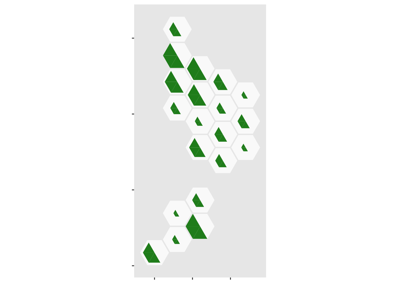
Now, do the same thing with the case data
ggplot(case_tri)+
  geom_dhb(data=popsize, aes(map_id=dhb),fill="grey98")+
  geom_dhbtri(data=pop_tri,aes(map_id=dhb,fill=group,class_id=order,radius=sqrt(Total)),
              coord=FALSE, show.legend=FALSE)+
  scale_fill_manual(values=c(blank=NA,Population="forestgreen",Cases="gold",empty=NA))+
  geom_dhbtri(data=case_tri, aes(map_id=DHB,fill=group,class_id=order,radius=sqrt(Count)),
              coord=FALSE, show.legend=FALSE)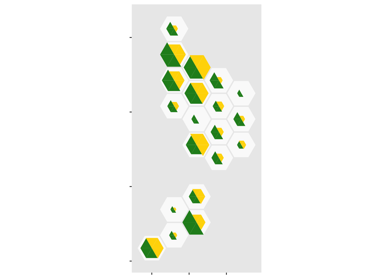
And add abbrevations for each District Health Board, offsetting them up so they don’t obscure the data
ggplot(case_tri)+
  geom_dhb(data=popsize, aes(map_id=dhb),fill="grey98")+
  geom_dhbtri(data=pop_tri,aes(map_id=dhb,fill=group,class_id=order,radius=sqrt(Total)),
              coord=FALSE, show.legend=FALSE)+
  scale_fill_manual(values=c(blank=NA,Population="forestgreen",Cases="gold",empty=NA))+
  geom_dhbtri(data=case_tri, aes(map_id=DHB,fill=group,class_id=order,radius=sqrt(Count)),
              coord=FALSE, show.legend=FALSE)+
  geom_label_dhb(short=TRUE, position=position_nudge(x=0,y=0.5),col="grey50",size=2.5)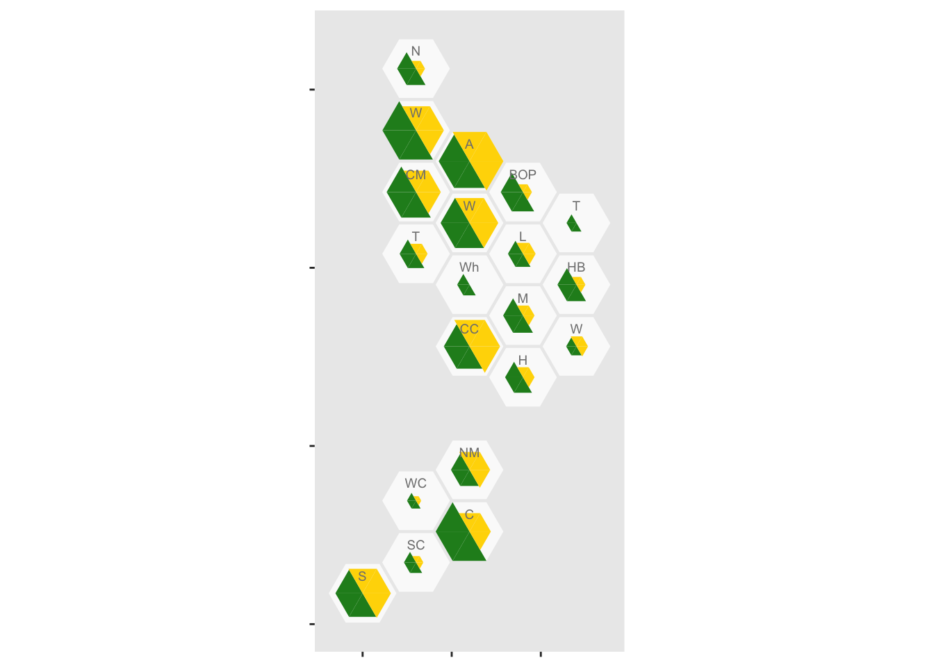
It looks as though rural areas are at lower risk, but so is Canterbury (about 80% of which is Christchurch). We might want to put confidence intervals on, to see if these differences are larger than you’d get from random variation. It’s easy to model the purely random part of this with a Poisson distribution, but we don’t have data on ascertainment rates so the variation will be underestimated.
I used poisson.test() to compute exact confidence intervals for the rates, since the counts in some areas are (happily) very small.
case_tri$low<-sapply(case_tri$Count, function(n) poisson.test(n)$conf.int[1])
case_tri$high<-sapply(case_tri$Count, function(n) poisson.test(n)$conf.int[2])

case_tri$total_scaled<- with(case_tri, 0.95*Count/max(high))
case_tri$low_scaled<- with(case_tri, 0.95*low/max(high))
case_tri$high_scaled<- with(case_tri, 0.95*high/max(high))
Also, I want the population half of the hex scaled to match the true count, not the outer confidence limit
pop_tri$total_scaled<- 0.95*pop_tri$Total*max(case_tri$total_scaled)/max(pop_tri$Total)And finally, we can assemble it. First, the population half
ggplot(case_tri)+
    geom_dhb(data=popsize, aes(map_id=dhb),fill="grey98")+
    geom_dhbtri(data=pop_tri,
                aes(map_id=dhb,fill=group,class_id=order,radius=sqrt(total_scaled)),
                coord=FALSE, show.legend=FALSE)+
    scale_fill_manual(values=c(blank=NA,Population="forestgreen",Cases="magenta",empty=NA))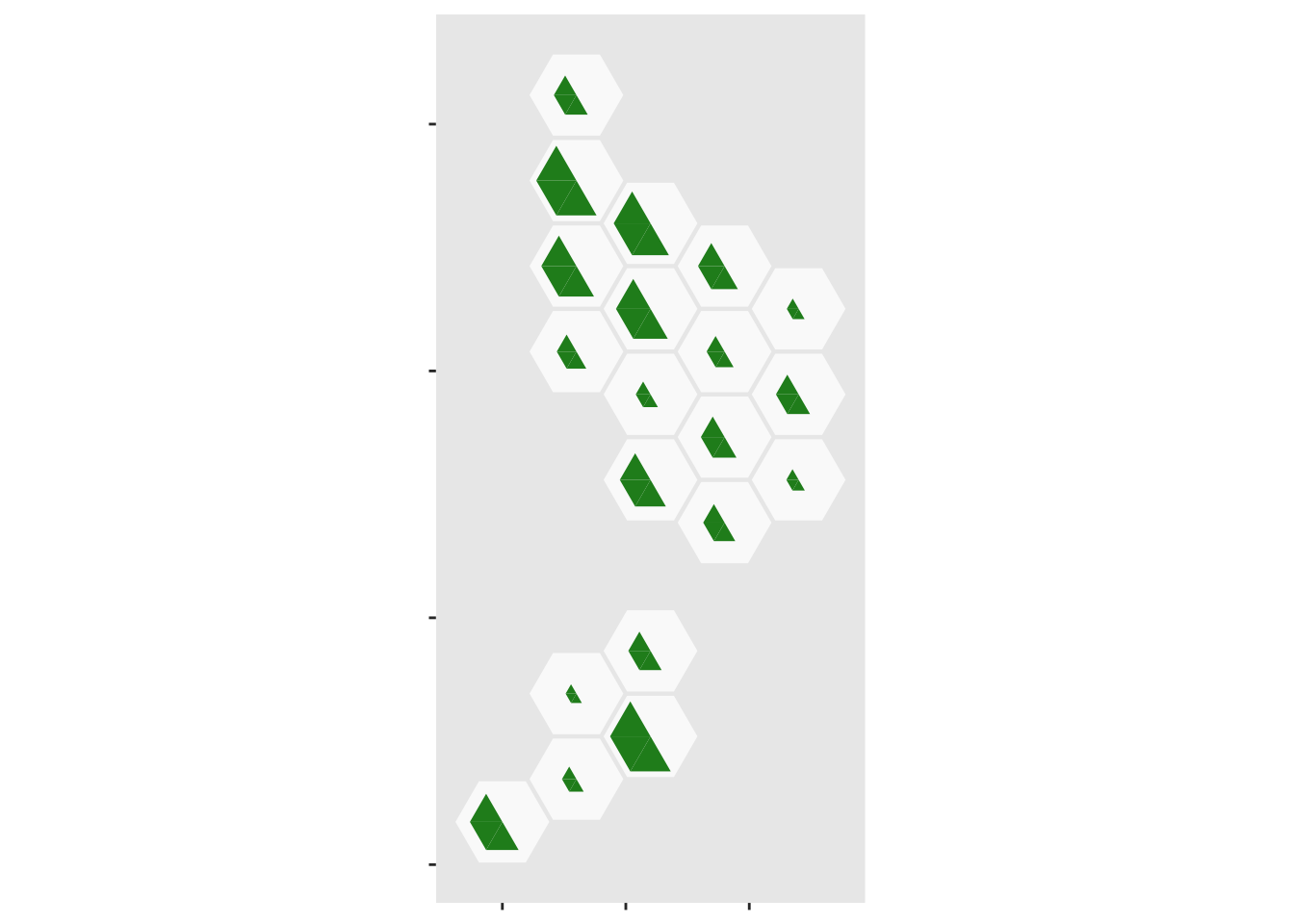
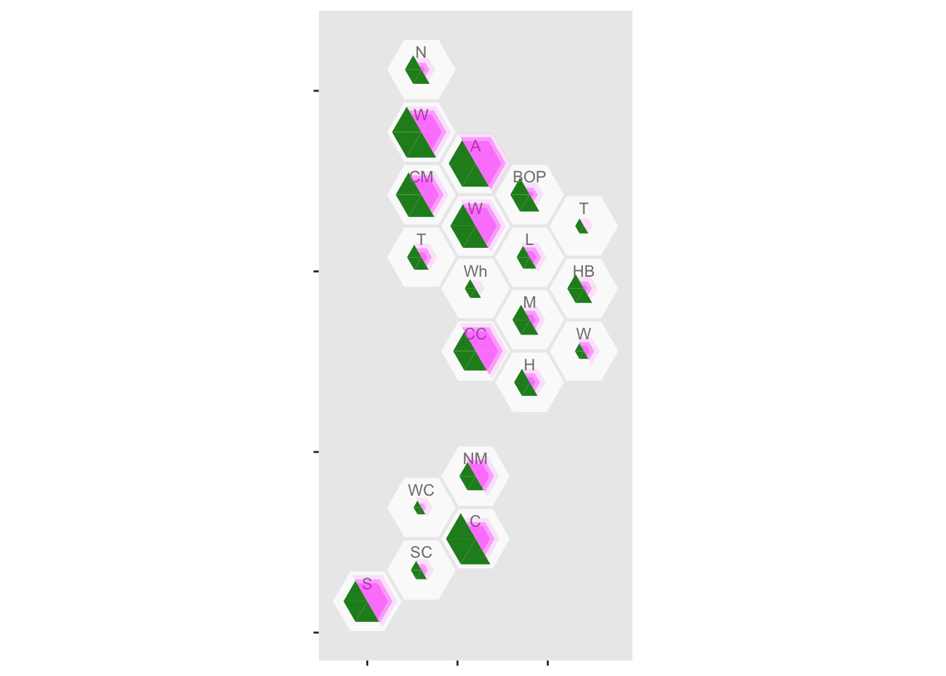
Now add the case half in three, partially transparent, sections: the upper limit, the observed value, then the lower limit
ggplot(case_tri)+
    geom_dhb(data=popsize, aes(map_id=dhb),fill="grey98")+
    geom_dhbtri(data=pop_tri,
                aes(map_id=dhb,fill=group,class_id=order,radius=sqrt(total_scaled)),
                coord=FALSE, show.legend=FALSE)+
    scale_fill_manual(values=c(blank=NA,Population="forestgreen",Cases="magenta",empty=NA))+
    geom_dhbtri(data=case_tri,
                aes(map_id=DHB,fill=group,class_id=order,radius=sqrt(high_scaled)),
                alpha=0.1,coord=FALSE, show.legend=FALSE)+
    geom_label_dhb(short=TRUE,position=position_nudge(x=0,y=0.5),
                   col="grey50",size=3)+
    geom_dhbtri(data=case_tri,
                aes(map_id=DHB,fill=group, class_id=order, radius=sqrt(total_scaled)),
                alpha=0.3,coord=FALSE, show.legend=FALSE)+
    geom_dhbtri(data=case_tri,
                aes(map_id=DHB,fill=group,class_id=order,radius=sqrt(low_scaled)),
                alpha=0.3,coord=FALSE, show.legend=FALSE)