I’m involved a research project that, among other things, will be comparing various health variables across NZ District Health Boards (DHBs). In order to make the outputs less boring and (hopefully!) more interpretable, I want some maps.
This post is about ‘DHBins’, a set of hexmaps vaguely analogous to the square ‘statebins’ for US states. The code is in the DHBins package I’ll illustrate with some data on immunisation coverage in NZ kids.
First, the data. It’s from the NZ Social Indicators, giving the percentage of kids turning 5 years old who had completed their age-appropriate vaccinations. A related set of data is part of the quality targets for DHBs. We’ve got data for the whole population and broken down by the broadest ethnicity groups.
library(tidyverse)## ── Attaching packages ─────────────────────────────────────────────────────────────────────────────────────────────────────────────── tidyverse 1.2.1 ──## ✔ ggplot2 3.2.1 ✔ purrr 0.2.5
## ✔ tibble 2.0.1 ✔ dplyr 0.8.3
## ✔ tidyr 0.8.2 ✔ stringr 1.4.0
## ✔ readr 1.3.1 ✔ forcats 0.3.0## ── Conflicts ────────────────────────────────────────────────────────────────────────────────────────────────────────────────── tidyverse_conflicts() ──
## ✖ dplyr::filter() masks stats::filter()
## ✖ dplyr::lag() masks stats::lag()library(DHBins)
data(immune)
summary(immune)## DHB Ntotal Vaxtotal Pcttotal
## Length:20 Min. : 99.0 Min. : 79.0 Min. :0.790
## Class :character 1st Qu.: 355.0 1st Qu.: 302.5 1st Qu.:0.850
## Mode :character Median : 557.0 Median : 504.0 Median :0.875
## Mean : 798.4 Mean : 704.1 Mean :0.874
## 3rd Qu.:1046.8 3rd Qu.: 954.8 3rd Qu.:0.910
## Max. :2206.0 Max. :2015.0 Max. :0.950
##
## NNZE VaxNSE PctNZE NMaori
## Min. : 51.0 Min. : 46.0 Min. :0.8400 Min. : 18.0
## 1st Qu.:141.5 1st Qu.:122.0 1st Qu.:0.8850 1st Qu.:113.8
## Median :236.0 Median :209.5 Median :0.9100 Median :148.0
## Mean :314.2 Mean :285.4 Mean :0.9030 Mean :195.2
## 3rd Qu.:369.0 3rd Qu.:339.2 3rd Qu.:0.9225 3rd Qu.:269.2
## Max. :947.0 Max. :904.0 Max. :0.9500 Max. :492.0
##
## VaxMaori PctMaori NPacific VaxPacific
## Min. : 15.00 Min. :0.770 Min. : 15.00 Min. : 13.0
## 1st Qu.: 94.75 1st Qu.:0.820 1st Qu.: 22.75 1st Qu.: 21.0
## Median :133.50 Median :0.850 Median : 40.50 Median : 39.0
## Mean :166.05 Mean :0.858 Mean :108.29 Mean :103.5
## 3rd Qu.:242.25 3rd Qu.:0.910 3rd Qu.: 80.25 3rd Qu.: 71.0
## Max. :428.00 Max. :0.940 Max. :649.00 Max. :595.0
## NA's :6 NA's :7
## PctPacific NAsian VaxAsian PctAsian
## Min. :0.6000 Min. : 24.0 Min. : 18.0 Min. :0.750
## 1st Qu.:0.8500 1st Qu.: 35.0 1st Qu.: 31.0 1st Qu.:0.890
## Median :0.9100 Median : 76.0 Median : 69.0 Median :0.910
## Mean :0.8958 Mean :189.1 Mean :173.7 Mean :0.919
## 3rd Qu.:0.9750 3rd Qu.:212.0 3rd Qu.:196.5 3rd Qu.:0.970
## Max. :1.0000 Max. :679.0 Max. :620.0 Max. :1.000
## NA's :1 NA's :5 NA's :5
## NOther VaxOther PctOther
## Min. : 10.00 Min. : 10.00 Min. :0.2700
## 1st Qu.: 27.25 1st Qu.: 23.00 1st Qu.:0.6525
## Median : 50.50 Median : 44.50 Median :0.7400
## Mean : 75.44 Mean : 63.88 Mean :0.7185
## 3rd Qu.:112.25 3rd Qu.: 98.00 3rd Qu.:0.8400
## Max. :260.00 Max. :181.00 Max. :0.9300
## NA's :2 NA's :4The NA values are when the true values are too small for confidentiality and are suppressed. First, let’s get a picture of the sizes of the DHBs
par(mar=c(1,1,1,1))
with(immune,dhbin(radii=sqrt(Ntotal),DHB_names=DHB))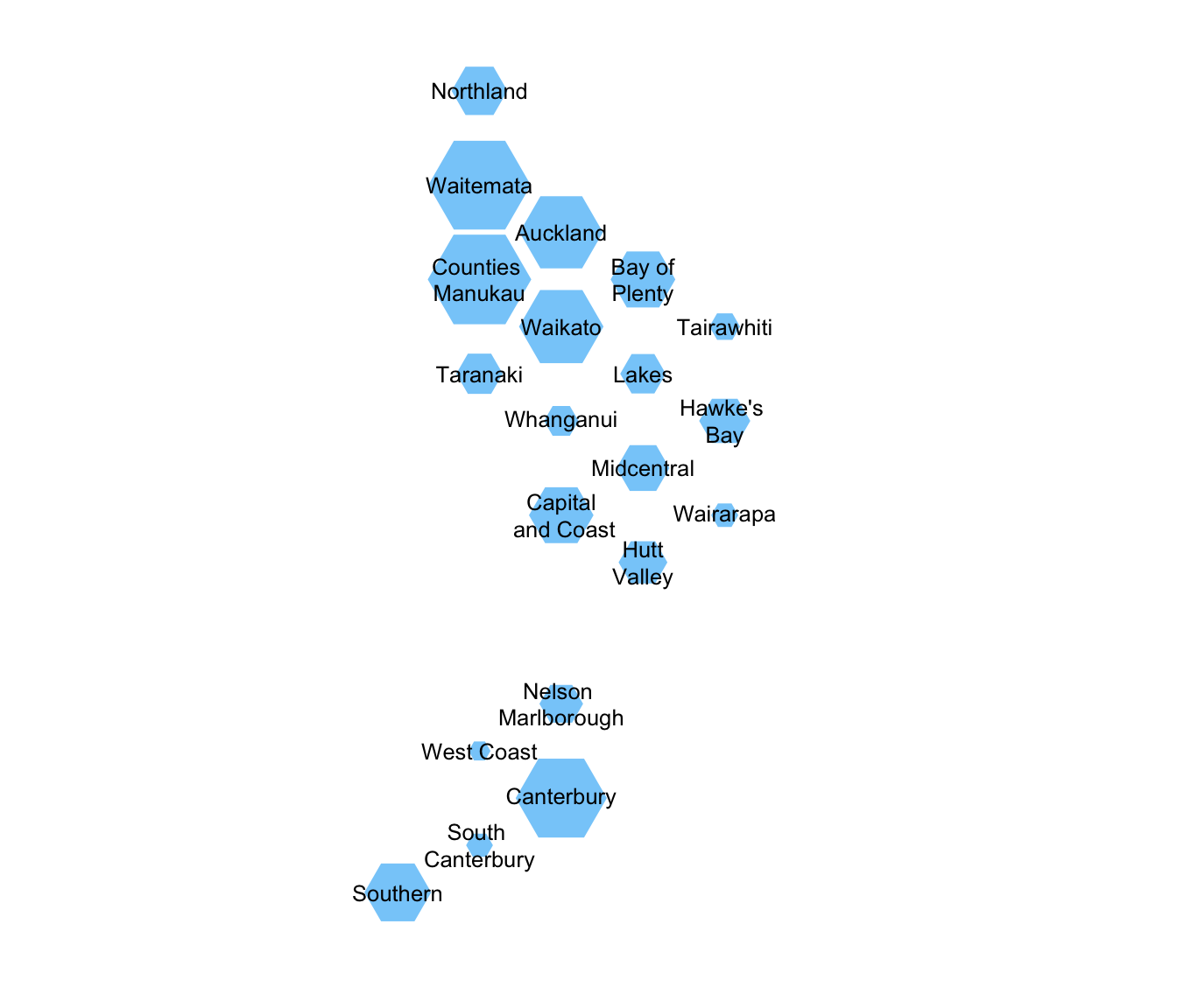
Now, the ethnic composition of each one. This is not a pie chart1.
eth_matrix<-immune %>%
    select(NNZE,NMaori,NPacific,NAsian,NOther) %>% as.matrix
rownames(eth_matrix)<-immune$DHB
eth_matrix[is.na(eth_matrix)]<-0
eth_hex<-tri_alloc(eth_matrix, colours=RColorBrewer::brewer.pal(5,"Pastel1"))

dhtri(tri_colours=eth_hex,
        legend_opts=list(fill=RColorBrewer::brewer.pal(5,"Pastel1"),
        border=NA, legend=c("NZ European","Māori","Pacific","Asian","Other")))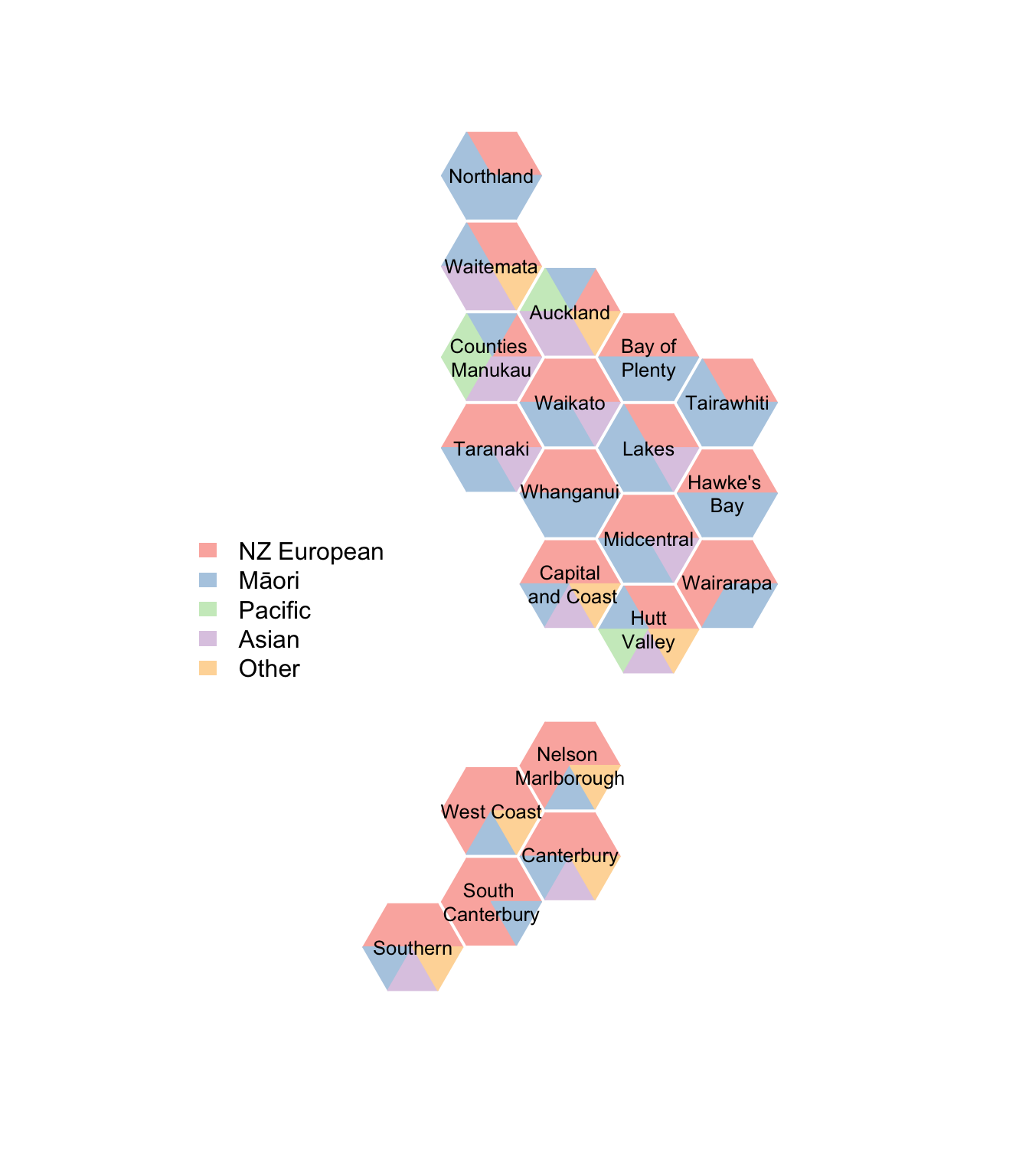
The “NZ European” group is much less dominant in 5-year-olds that in middle-aged people; emphasised by this being prioritised ethnicity, where multiple ethnicities are reduced to the first in a priority list that goes Māori, Pacific, Asian, Other, NZ European. The number of triangles a group gets is its proportion of the total rounded to the nearest sixth, with the Sainte-Laguë algorithm used to make this add up to exactly six sixths.
It might be helpful to scale these by population size
dhtri(radii=sqrt(immune$Ntotal),tri_colours=eth_hex,
        legend_opts=list(fill=RColorBrewer::brewer.pal(5,"Pastel1"),
        border=NA, legend=c("NZ European","Māori","Pacific","Asian","Other")))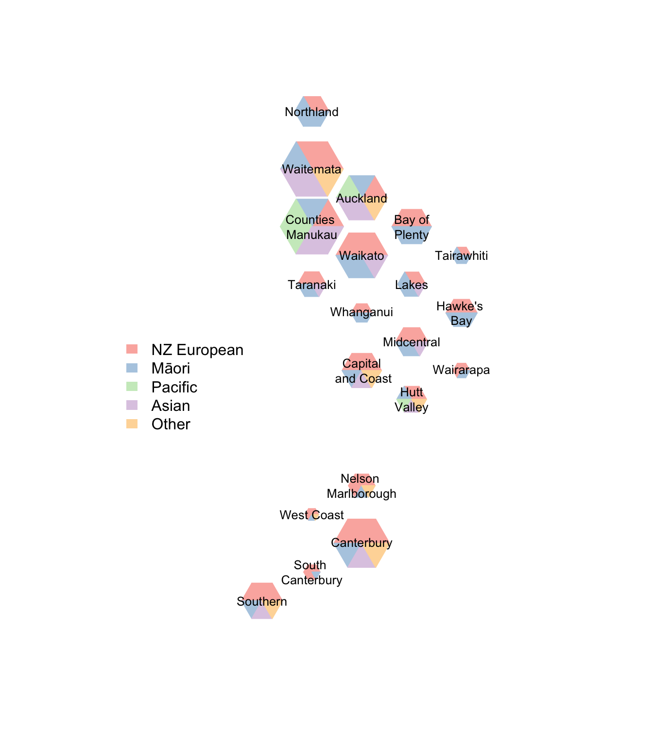
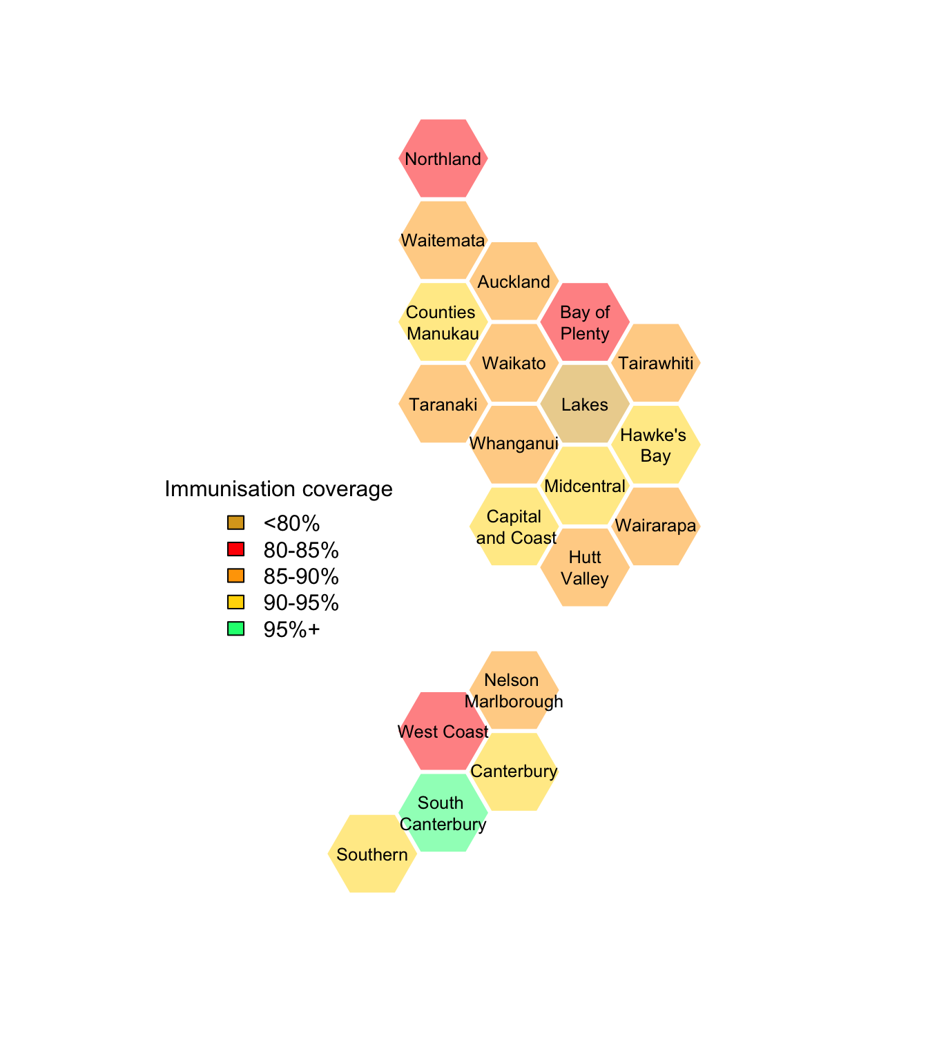
To show the vaccination coverage, we need to code the numeric proportion, taking account of the target being 95% (which is what you need for herd immunity to measles)2
code_vax<-function(pct,N,dhbnames){
    basecols<-case_when(
        is.na(N)~"lightgray",
        N<70 ~ "lightgray",
        pct< 0.80 ~ "goldenrod",
        pct< 0.85 ~ "red",
        pct <0.90 ~ "orange",
        pct <0.95 ~ "gold",
        pct>=0.95 ~ "springgreen"
        )
    cols<-adjustcolor(basecols,alpha.f=0.5)
    names(cols)<-dhbnames
    cols
}

with(immune,dhbin(hex_colours=code_vax(Pcttotal,Ntotal, DHB),
legend_opts=list(fill=c("goldenrod","red","orange","gold","springgreen"),
legend=c("<80%","80-85%","85-90%","90-95%","95%+"), title="Immunisation coverage")
))
And now, vaccine coverage by ethnicity; the gray hexes are where the total count is less than 70.
par(mfrow=c(3,2),mar=c(1,0,1,1))
with(immune,dhbin(hex_colours=code_vax(Pcttotal,Ntotal,DHB),short=TRUE))
title(main="All")
with(immune,dhbin(hex_colours=code_vax(PctNZE,NNZE,DHB),short=TRUE))
title(main="NZ European")
with(immune,dhbin(hex_colours=code_vax(PctMaori,NMaori,DHB),short=TRUE))
title(main="Māori")
with(immune,dhbin(hex_colours=code_vax(PctPacific,NPacific,DHB),short=TRUE))
title(main="Pacific")
with(immune,dhbin(hex_colours=code_vax(PctAsian,NAsian,DHB),short=TRUE))
title(main="Asian")
with(immune,dhbin(hex_colours=code_vax(PctOther,NOther, DHB),short=TRUE))
title(main="Other Ethnicities")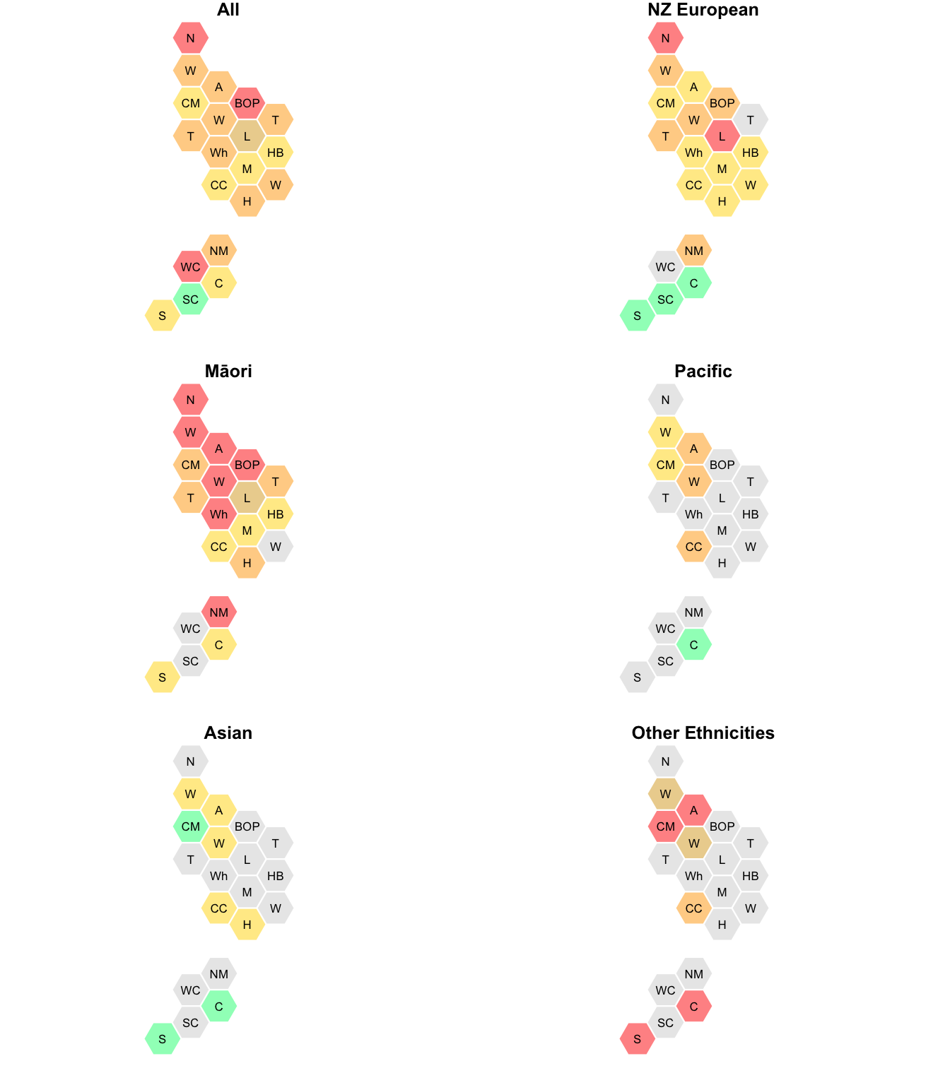
The short names aren’t unique (two Ts, three Ws) but they don’t need to be, since no-one who is likely to be looking at the maps will have any chance of confusing Tairawhiti and Taranaki or Waitemata and Waikato.