A couple of years ago, I stored a lot of Auckland bus location data for what was going to be a news story. It’s about time I did something with it, so I’m updating the analysis and I’ll be using it as a class example.
The data come from the Auckland Transport real-time API, for which Auckland Transport should be congratulated. Anyone can get an API key and use the data. Here I’m looking at an analysis of saved data across a a five-week period, so you don’t see the code for doing the downloads – look at the code for twitter bot @tuureiti if you want an example.
Load the raw data
My script saves a CSV file every ten minutes, so we can load them as a list of data frames. We’ll need the file names, which are time stamps.
files<-list.files(path="~/BUSDATA",pattern="csv",full.names=TRUE)
metadata<-tibble(
  timestamps = gsub(".*/BUSDATA/([0-9]{10})\\.csv","\\1",files)
)
datas<-map(files, ~read_csv(.,col_types=cols()))
names(datas)<-metadata$timestamps
Now, extract time, day, day of the week, week number, and weekend/weekday from the time stamps. We’re going to use different colours for weekdays vs weekends in the graph
metadata<-mutate(metadata,
    times = as.POSIXct(as.integer(timestamps),origin="1970-01-01"),
    days = factor(as.POSIXlt(times)$wday)) %>%
  mutate(weekdays = ifelse(days %in% c(6,0),0,1)) %>%
  mutate(week = (as.POSIXlt(times)$yday+1) %/% 7) %>%
  mutate(col90 = ifelse(weekdays==1, "goldenrod","skyblue"),
    col75 = ifelse(weekdays==1, "sienna","royalblue"))
Graph: distribution of deviation from schedule
These are essentially a series of really narrow boxplots. The y-axis is delay relative to the schedule. Each vertical line represents a ten-minute period between 6am and 10pm. The black segment contains the middle 50% of buses; the dark colour is the middle 75%, and the light colour is the middle 90%. (This could also be done with Earo Wang’s sugrrants calendar package.)
quantiles<-map(metadata$timestamps,
                  ~quantile(datas[[.]]$delay/60, c(0.05,0.125,0.25,0.75,0.875,0.95), na.rm=TRUE)) %>%
           invoke(.f=rbind)


par(mfrow=c(5,1),mar=c(3,3,.5,.5),las=1)

for(i in 5:9){
xl<-with(metadata, min(times[week==i]))
xu<-xl+6*24*60*60+17*60*60
plot(quantiles[,1]~times, subset=week==i,
     type="h",col=col90, data=metadata,
     xlim=range(xl,xu),ylim=c(-10,30),
     xlab="",ylab="Deviation from schedule")


points(quantiles[,6]~times,subset=week==i,
       col=col90, data=metadata, type="h")
points(quantiles[,2]~times,subset=week==i,
       col=col75, data=metadata, type="h")
points(quantiles[,5]~times,subset=week==i,
       col=col75, data=metadata, type="h")
points(quantiles[,3]~times,subset=week==i,
       col="black", data=metadata, type="h")
points(quantiles[,4]~times,subset=week==i,
       col="black", data=metadata, type="h")

abline(h=0,col="white")

}
Some of the visible patterns have clear explanations. On weekdays there is a morning peak and a double afternoon peak: school and work commutes overlap in the morning but not in the evening. There is no clear peak on weekend days, though there is a slight slowdown around midday on Saturdays. Importantly, the deviations from schedule are in both directions; buses are early as well as late. Major improvements in on-time performance would need the variation in travel times to be reduced – for example, with bus lanes. Some improvement is possible by adjusting the published schedule to reflect where buses are often late, but this will tend to make more buses early.
There are a few specific days that deserve extra comment. Monday, February 6 has the same pattern as typical weekend days; it was Waitangi Day, a public holiday. On the Saturday, February 11, the Auckland Lantern Festival closed a number of streets near Auckland Domain, and many people attending the festival would have tried to take buses in the evening. The large delays there are for a relatively small number of buses. March 7 and March 11 saw heavy rain in Auckland, slowing down all traffic and delaying the buses. My data collection script failed on the morning of Tuesday, February 7; the sporadic vertical white lines result from occasional timeouts when calling the Auckland Transport API.
Graph: percentage punctuality
Instead of a vertical axis showing deviation from schedule in minutes, we could look at numbers of buses. The green buses are on time. The orange buses are 5-10 minutes early (at the bottom) or late (at the top), and the dark red buses are more than 10 minutes early (at the bottom) or late (at the top)
par(mfrow=c(5,1),mar=c(3,3,.5,.5),las=1)

buscount<-function(data){
    mutate(data, delaycat=cut(delay/60, c(-Inf,-10,-5,5,10,Inf))) %>%
    select(delaycat) %>%
    table %>%
    cumsum
}

latecounts<-map(datas, buscount) %>%
           invoke(.f=rbind)

for(i in 5:9){
xl<-with(metadata, min(times[week==i]))
xu<-xl+6*24*60*60+17*60*60

plot(latecounts[,1]~times, data=metadata, subset=week==i,type="n",
     ylab="number of buses active", xlab="Day (6am-10pm)",
     xlim=range(xl,xu),ylim=range(0,latecounts))

with(metadata, {
segments(times[week==i],0,times[week==i],latecounts[,1][week==i],col="darkred")
segments(times[week==i],latecounts[,1][week==i],times[week==i],latecounts[,2][week==i],col="orange")
segments(times[week==i],latecounts[,2][week==i],times[week==i],latecounts[,3][week==i],col="green")
segments(times[week==i],latecounts[,3][week==i],times[week==i],latecounts[,4][week==i],col="orange")
segments(times[week==i],latecounts[,4][week==i],times[week==i],latecounts[,5][week==i],col="darkred")
})
}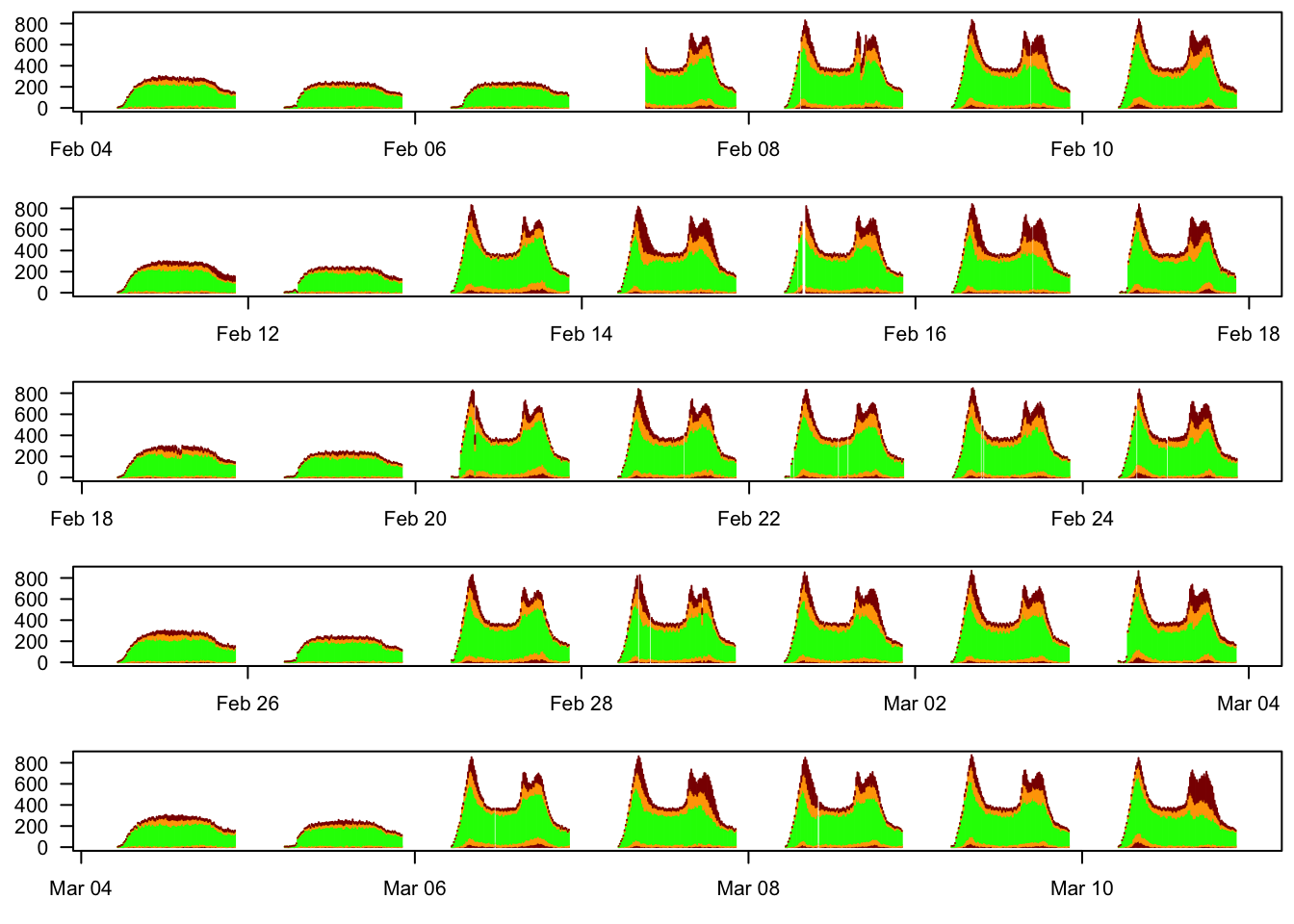
The weekday/weekend differnece in services is dramatic. Buses tend to be late during the peaks (as we saw before), and perhaps more of them are late on the trailing edge of the peak. The rain effect on March 11 show up clearly, but you need to look carefully to see the impact of the Lantern Festival on February 11 – the rain affected many more buses.
Punctuality by stop number
The official Auckland Transport punctuality metric is the percentage of trips leaving the first stop on the route within 5 minutes of the scheduled time. I don’t know how this metric was chosen, but I can imagine it being a good choice for contracts with bus companies: it’s easy to audit and is more under the control of the company than punctuality at later stops. It’s a terrible way to report punctuality to passengers, though.
Let’s see how punctuality varies over a trip.
stopdelays <- datas %>%
  invoke(.f=rbind) %>%
  filter(delay> -10*60 & delay < 30*60) %>%
  filter(stop.sequence <= 15)
 ggplot(stopdelays, aes(x=delay/60, y=stop.sequence, group=stop.sequence))+
    geom_density_ridges(scale = 1.5)
## Picking joint bandwidth of 0.324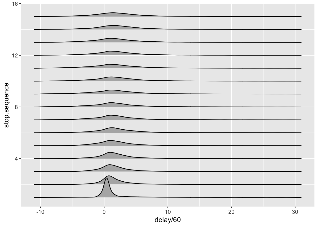
 stopdelays %>%
   mutate(not_late= delay<= 5*60) %>%
   group_by(stop.sequence) %>%
   summarise(ontime=mean(not_late)) %>%
   ggplot(aes(x=stop.sequence,y=ontime))+geom_point()+geom_line()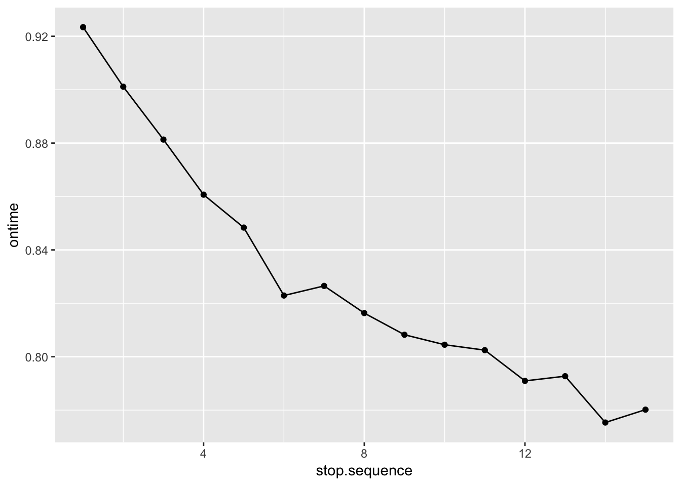
Buses are much closer to the schedule at the first stop than at even the second stop. Partly that’s just because it’s easier to be on time at the start, but such a large difference does also suggest that the first-stop performance is being optimised because it is reported.
Which bus companies?
At the time I was collecting the data, there were allegations that the new south Auckland routes had worse performance. Since these routes are run by a company, Go Bus, that didn’t run any of the routes, it’s fairly easy to do a comparison.
One complication: the route and trip id fields in the data have a lot of versioning information, which I’ll just strip off. I’ll also take out school buses, which have separate problems.
routes<-read_csv("~/routes.txt", col_types=cols())
routes <- mutate(routes, route_id=substr(route_id,1,5))
trips<-read_csv("~/trips.txt",col_types=cols())
trips <- mutate(trips, route_id=substr(route_id,1,5))

notschool <- left_join(trips, routes) %>%
      filter( trip_headsign != "Schools") %>%
      distinct(route_id, .keep_all=TRUE)
## Joining, by = "route_id"longnames<-tibble(agency_id=c("ABEXP","BTL","GBT",
"HE","NZBGW","NZBML",
"NZBNS","RTH","UE",
"WBC"),
longname=c( "SkyBus","Birkenhead Transport", "Go Bus",
"Howick and Eastern", "Go West (NZ Bus)", "Metrolink (NZ Bus)",
"North Star (NZ Bus)", "Ritchies Transport", "Urban Express",
"Waiheke Bus Company")
)
notschool <- left_join(notschool,longnames)## Joining, by = "agency_id"datas %>%
invoke(.f=rbind) %>%
mutate(route_id=substr(route,1,5)) %>%
inner_join(notschool) %>%
mutate(not_late=delay < 5*60, on_time = delay < 5*60 & delay> -1*60) %>%
group_by(longname) %>%
summarise(on_time=mean(on_time), not_late=mean(not_late)) -> agency_late## Joining, by = "route_id"ggplot(agency_late, aes(x=on_time, y=longname))+geom_point()+xlab("Proportion on time")+ylab("")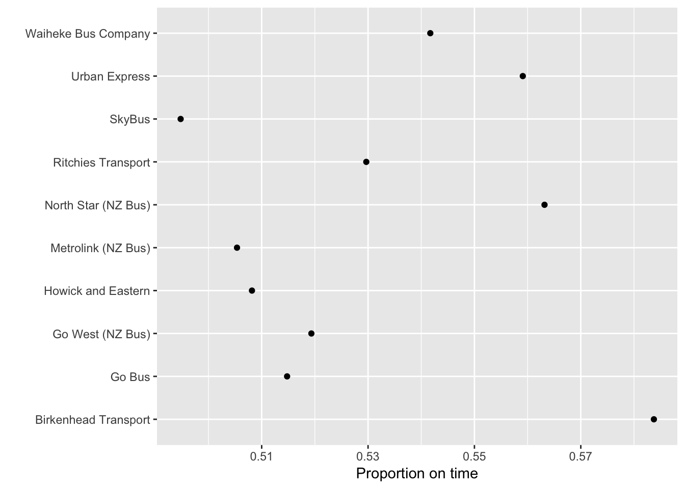
ggplot(agency_late, aes(x=not_late, y=longname))+geom_point()+xlab("Proportion not late")+ylab("")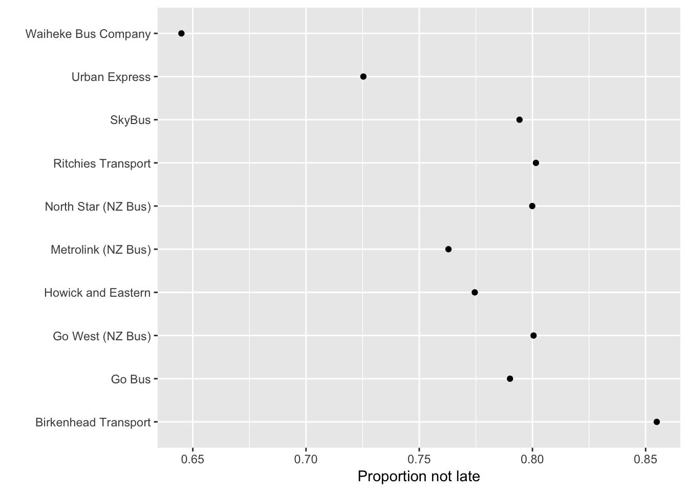
The outlier is the Waiheke Bus Company, who are in a special situation in that their buses are scheduled to meet the ferry and so will depart late if the ferry is late. There was nothing distinctive about Go Bus and the south Auckland routes.
The punctuality numbers look very poor for ‘Proportion on time’. This is slightly unfair; a few of the buses that are marked down as early will actually be waiting at the stop until they are on time. It’s only slightly unfair, though. Many buses really do run early except at a small number of major stops where they sit and wait.