So, as you know, Hillary Clinton narrowly lost the Electoral College and probably narrowly won the popular vote. And there’s lots of theorising about how these huge swings came about and what they mean. An important first step is to think about how big the swings really were.
Here are some graphs of county-level votes in 2012 and 2016. In all the graphs, the number of votes for the candidate is scaled by the 2012 total for the county, and is then weighted by that same 2012 total.
Scaling is necessary because otherwise LA County dominates the map and all the smaller counties are crushed down towards the origin. However, using the same total for both years lets us distinguish to a limited extent between swings from one party to the other and changes in turnout. And using weights lets us get a better visual idea of the actual number of votes involved – a small proportion of LA County is a lot more votes than the same small proportion of Glynn County, GA.
You know how scaling is done. Weighting is done by making the hexagons bigger. In these scatterplots, the area of a hexagon is proportional to the total number of 2012 votes in the hexagonal grid cell.
First, change in the individual parties

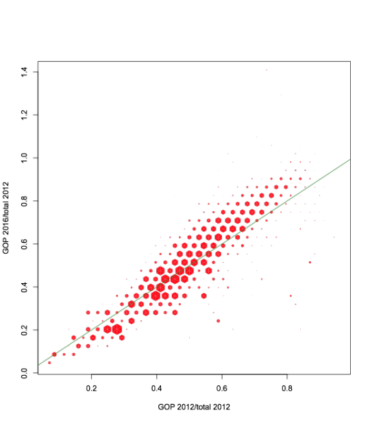
Turnout was down – and down more among Democrats. But there wasn’t a huge swing.
Now the changes for the two parties. First, colored according to the partisan preference of the county itself:
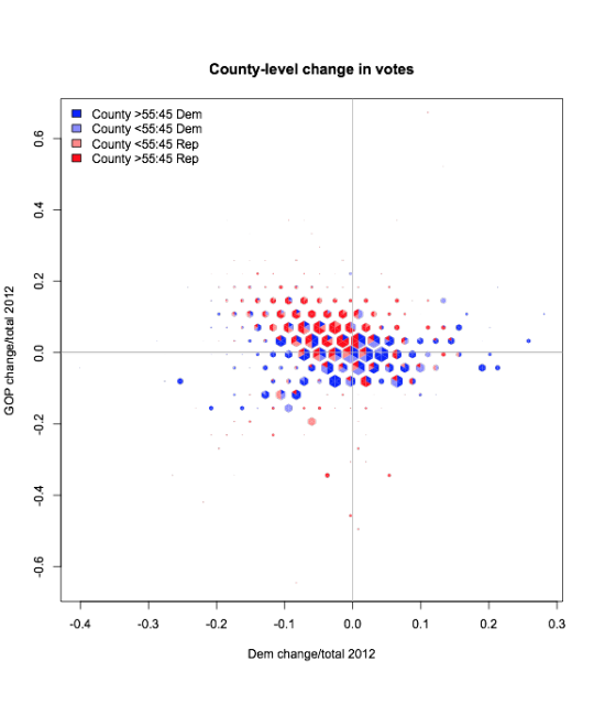
Republican counties tended to increase Republican turnout and decrease Democratic turnout. Democratic counties were split, but overall went down more than up.
Now, coloured by the partisan preference of the state as a whole – which is relevant, because the Electoral College makes states matter a lot.
