Wade at Minding Data wrote about a local NZ radio station
One of the main criticisms of The Rock, is that even if it doesn’t play the same song between 9 – 5, it still plays the same song everyday, often at the same time. To be fair to them, it’s probably no different to the criticism hurled at any popular radio station really. Anecdotal, I used to listen to the radio as I was getting up in the morning, and I used to swear that for weeks on end, I would be getting up to the same song.
He scraped data from their website and did some analysis, but didn’t end up answering the original question. So I thought I’d have a go. My code is here.
The first step is to get the time of day for each song, which is just string processing. Next, I turned it into an angle, like the hour hand of a 24-hour clock. Midnight is straight up, the morning is on the right, noon is straight down, the afternoon is on the left.
Each song play is then represented by a point on the unit circle, or more usefully by a vector from the center to that point. You can add up plays of the same song to get a longer vector. If they tend to be at the same time of day, the vector will be long and point in the direction of that time of day; if they are spread evenly across the day, the vectors will cancel and the resulting total vector will be short. Actually I did this for groups, not individual songs, so the sample sizes would be more useful. The darkness of each point is proportional to the number of plays for songs from that group
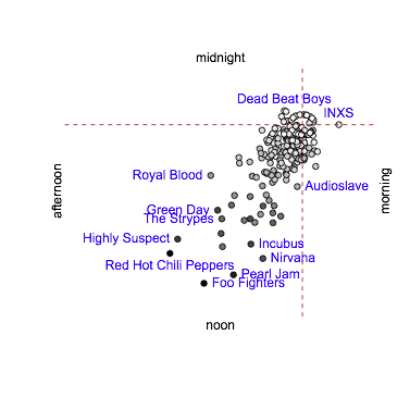
There looks to be a pattern. Unfortunately, the data aren’t complete and aren’t spread uniformly through 24 hours anyway. The big splurge of data to the mid-afternoon is because there are more songs there in the data set – that’s why the colour scale matches the distance so neatly.
I can subtract off the mean vector from each individual song or group vector to remove the bias and recenter the distribution
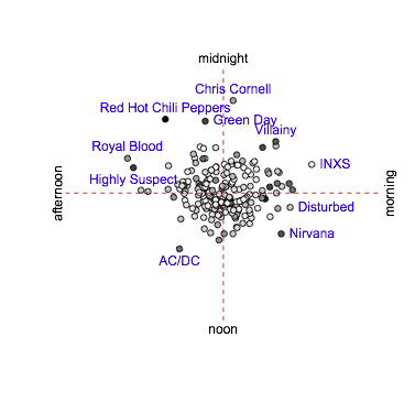
This is less interesting, though there still look to be some patterns. At this point I did a set of per-group t-tests, and didn’t understand the results. The problem with this second graph is that groups with lots of plays will tend to have points that are further out – the sum of \(n\) mean-zero variables has standard deviation proportional to \(\sqrt{n}\).
As the next step, I scaled by \(1/\sqrt{n}\) for each group
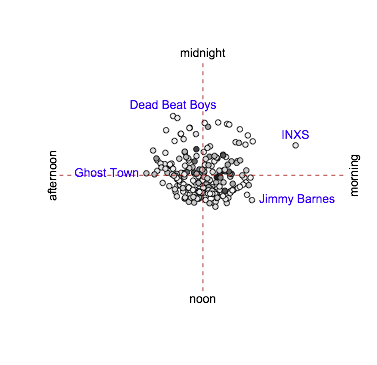
There’s a lot less going on. The signal for INXS may be real: they were played just three times, but at 5:12am, 5:27am, and 7:22am (on different days). Otherwise, the phrase “robustly null” springs to mind.
If I had to invent a moral for this exercise to justify it being a blog post, it might be the importance of subtracting off the uninteresting signals, even in drawing a graph, to let you see the interesting signal